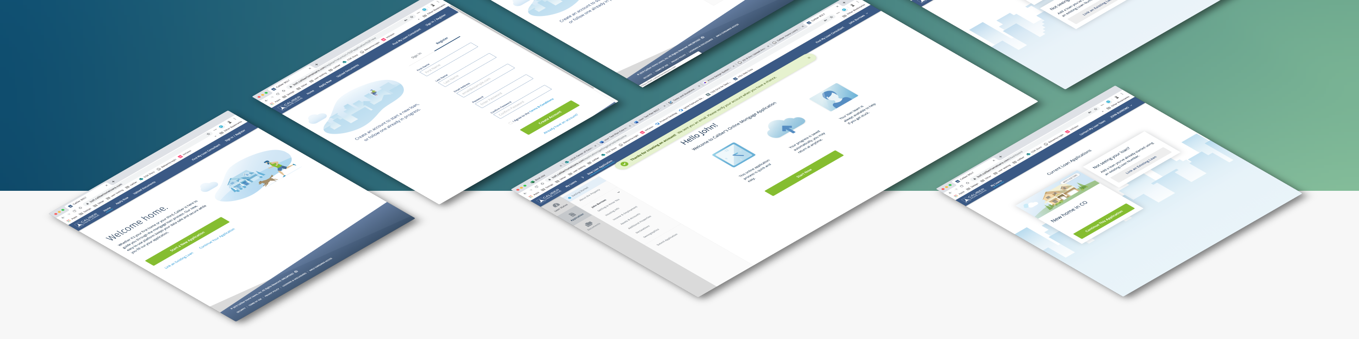
Borrower Mortgage App
My Role
Principal UX Designer
- Research
- User Testing
- Wireframes
- Illustrations
- Prototyping
Other Team Members:
- Product Manager
- Lead Developer
- Principal UX Engineer
- Principal UX Designer
Timeframe: 5 Months
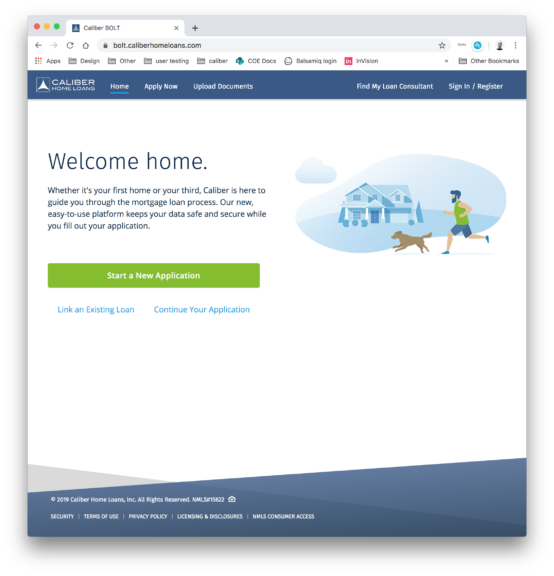
Challenge
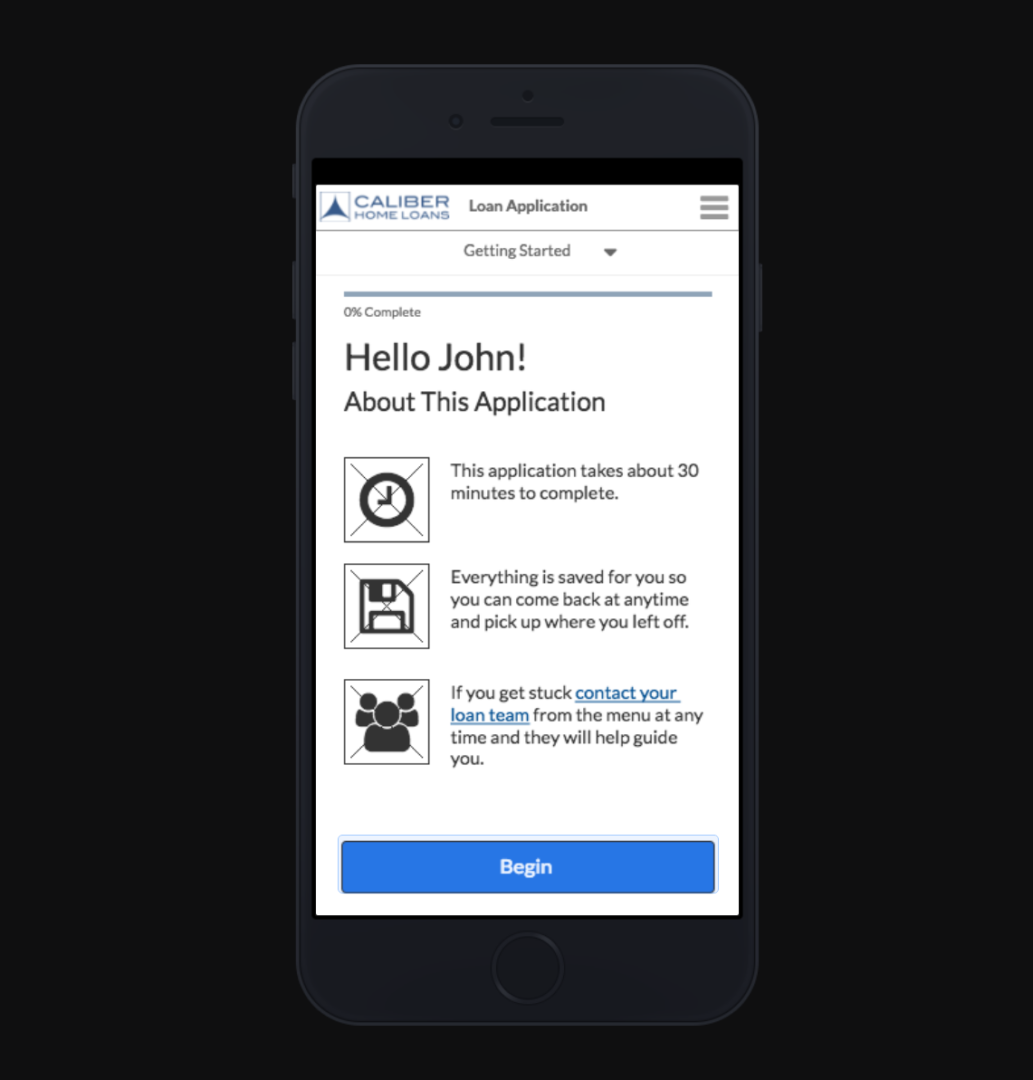
Redesign and rebuild the entire customer facing mortgage application as a mobile-first loan application.
“To be better than Blend” (the best in class competitor)

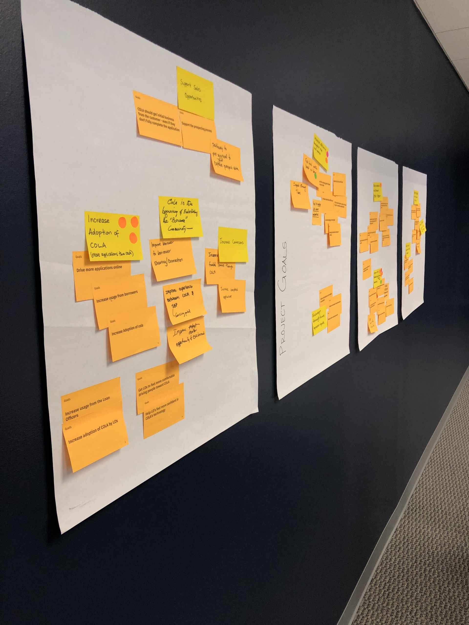
Goals
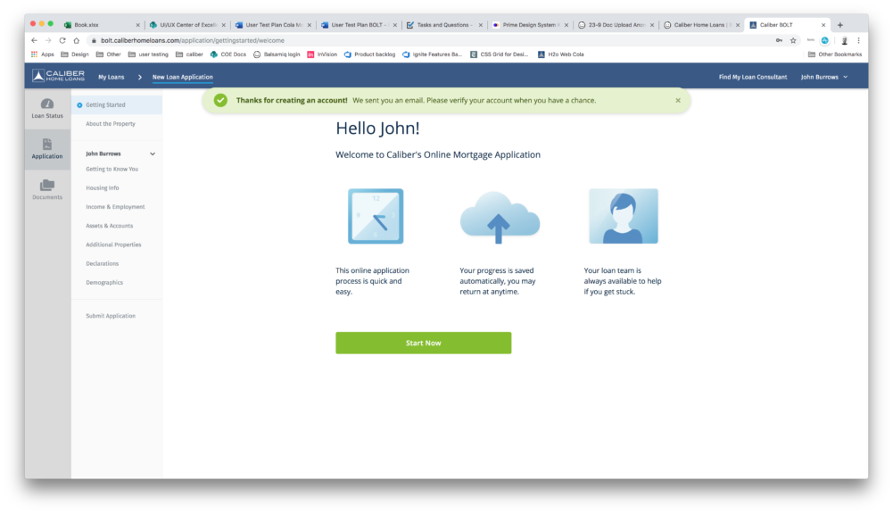
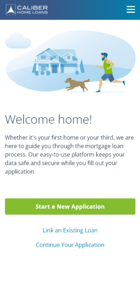
- Mobile first responsive design
- Streamline application process
- Reduce time to complete or time spent in application
- Increase number of applications submitted
- Increase quality and completeness of submitted apps
- Increase digital verification adoption
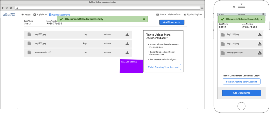
- Improve ease of providing documentation
- Decrease loan officer touch points
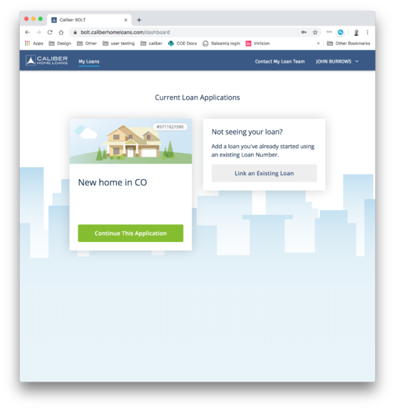
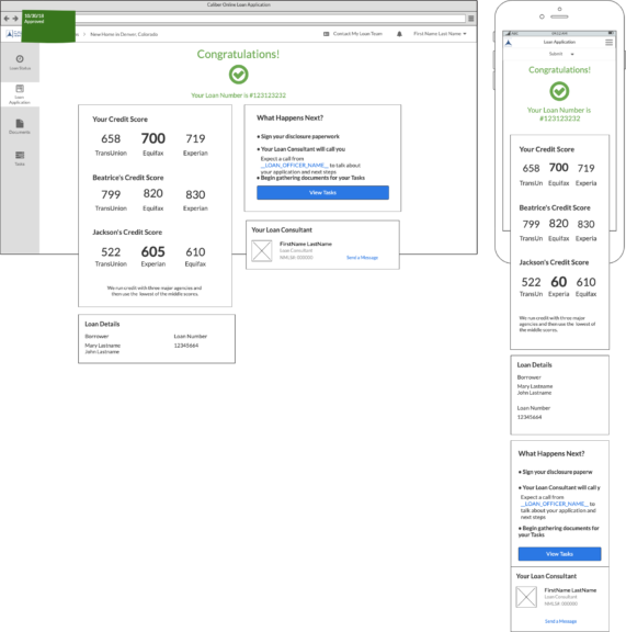
- Communicate loan status and progress
Problems to Solve
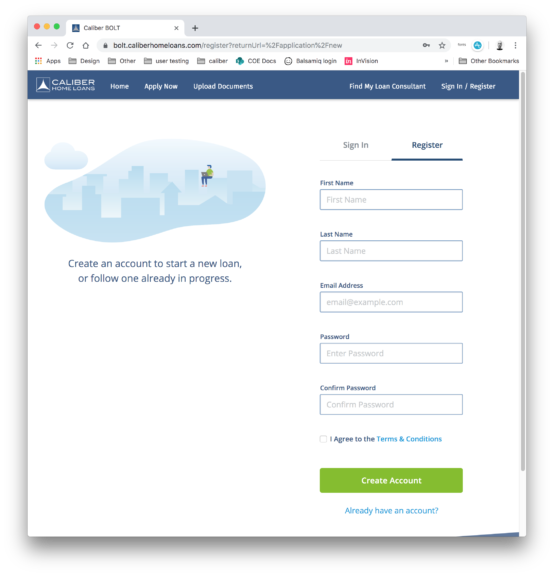
- Original portal was not mobile friendly
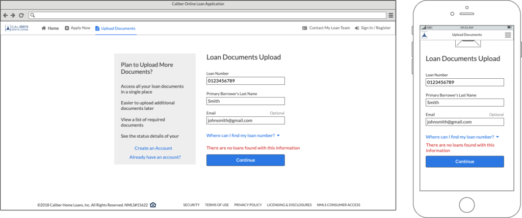
- Sign up process asked borrowers for too much info
- 50 percent drop off on registration screen
- Submitted applications were incomplete
- Application errors preventing digital verification
- Low adoption of digital verification services
- Borrower documentation was missing or incorrect
- Loan officers had to walk borrowers through each step
- Borrowers had no visibility about loan progress
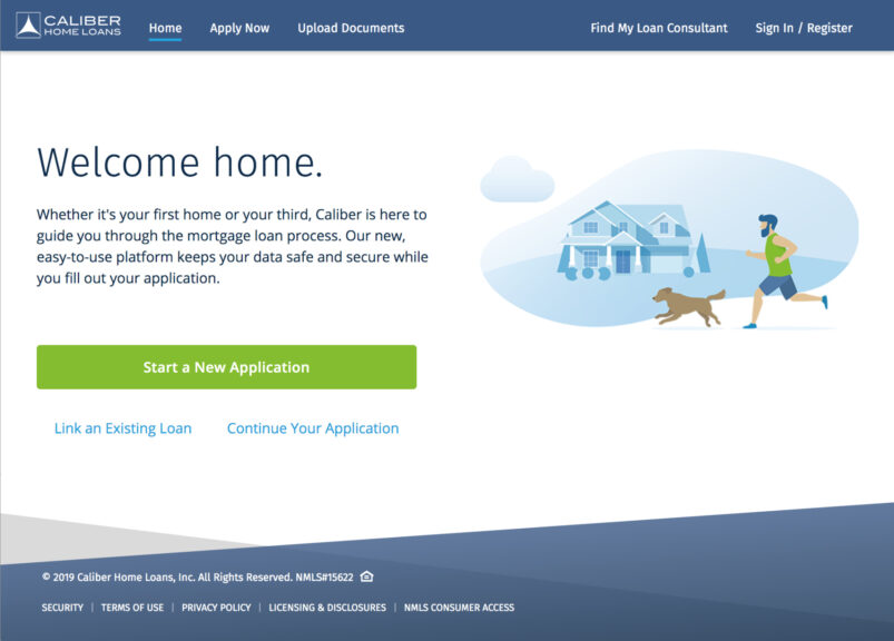
The existing customer portal was not optimized for mobile at all.
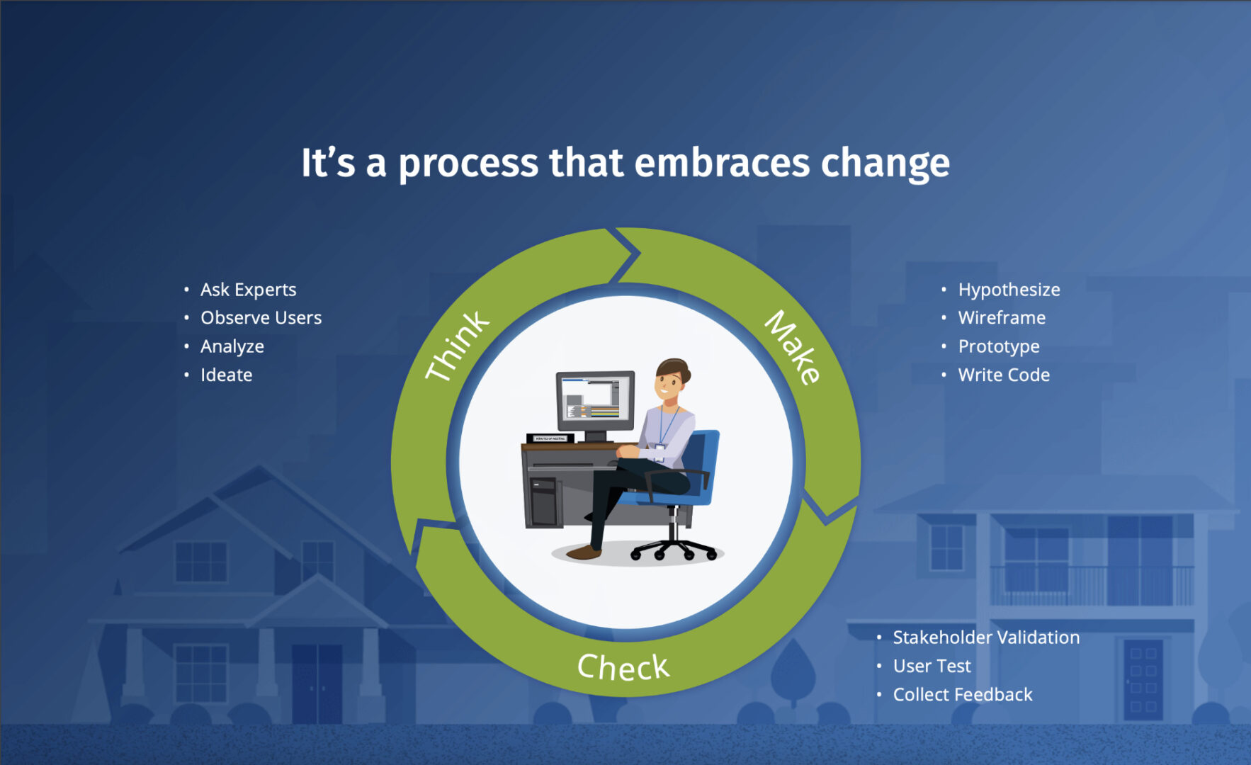
Process Summary
- Discovery Activities
- Project discovery plan – activities and artifacts
- Stakeholder interviews
- User journey mapping
- Heuristic evaluation of current state portal
- Competitive analysis
- Baseline unmoderated usability testing
- User test synthesis
- Google Analytics analysis
- Loan Officer survey
- Loan Officer interviews and observations
- Project kickoff collaboration session
- Story mapping, affinity mapping
- Roadmap prioritization
- Ideation
- Revised user journey
- White boarding
- Sketch & wireframes
- Clickable prototyping
- Visual style exploration
- Validation
- User testing – mobile & desktop prototypes
- User testing – dev environment
- UX Audit and refinement of implementation
- Pilot testing with select users
- Post-launch baseline user test
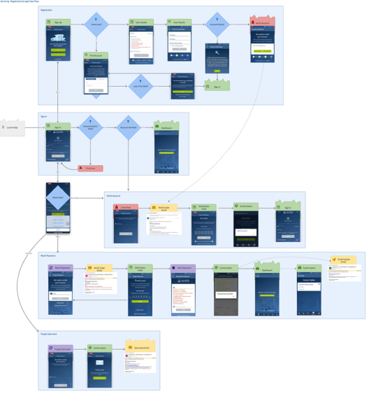
Discovery – User Journey Mapping

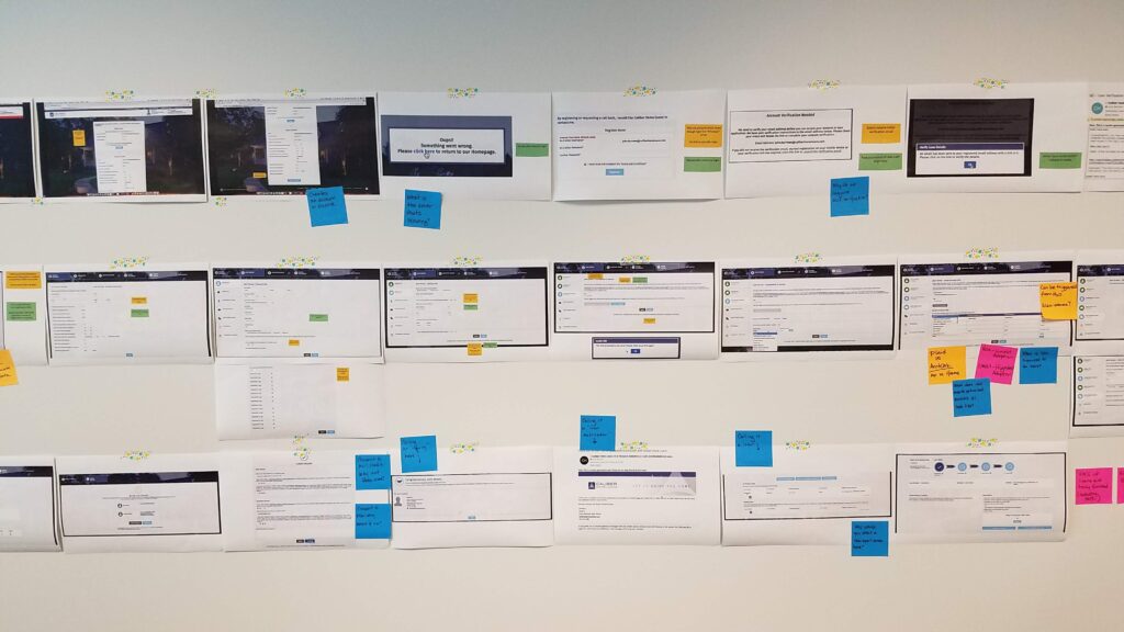
Discovery – Baseline Usability Study
- Users spent 14 minutes to 26 minutes
- 4 of 6 users received “Oops! Something went wrong…” error during registration.
- If a user encountered the registration error, no verification email was sent
- All users understood the purpose of using a SSN for VOE
- Only 1 user preferred digitally verifying employment
- Users were concerned about the security around digital verification
- Users did not seem to feel overwhelmed by the amount questions
User feedback indicated they feel the process takes “…the right amount of time”
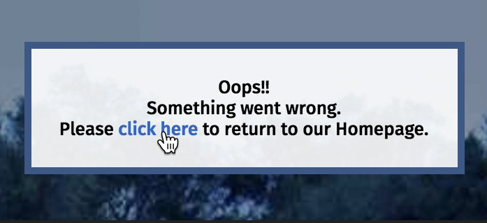
“Oops!! Sorry you got an unhelpful error while registering. Maybe our competitors can help you…”
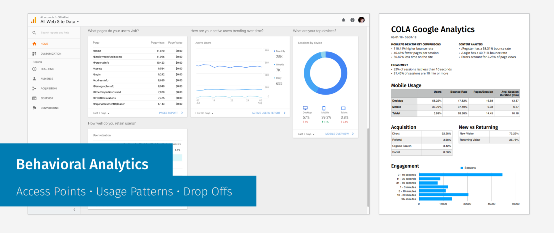
Discovery – Behavioral Analytics
We learned ~43% of users were trying to access the portal via mobile devices.
We identified ~50% of users were bouncing on the account registration step.
I later confirmed with user testing that there was a bug preventing users from successfully registering.
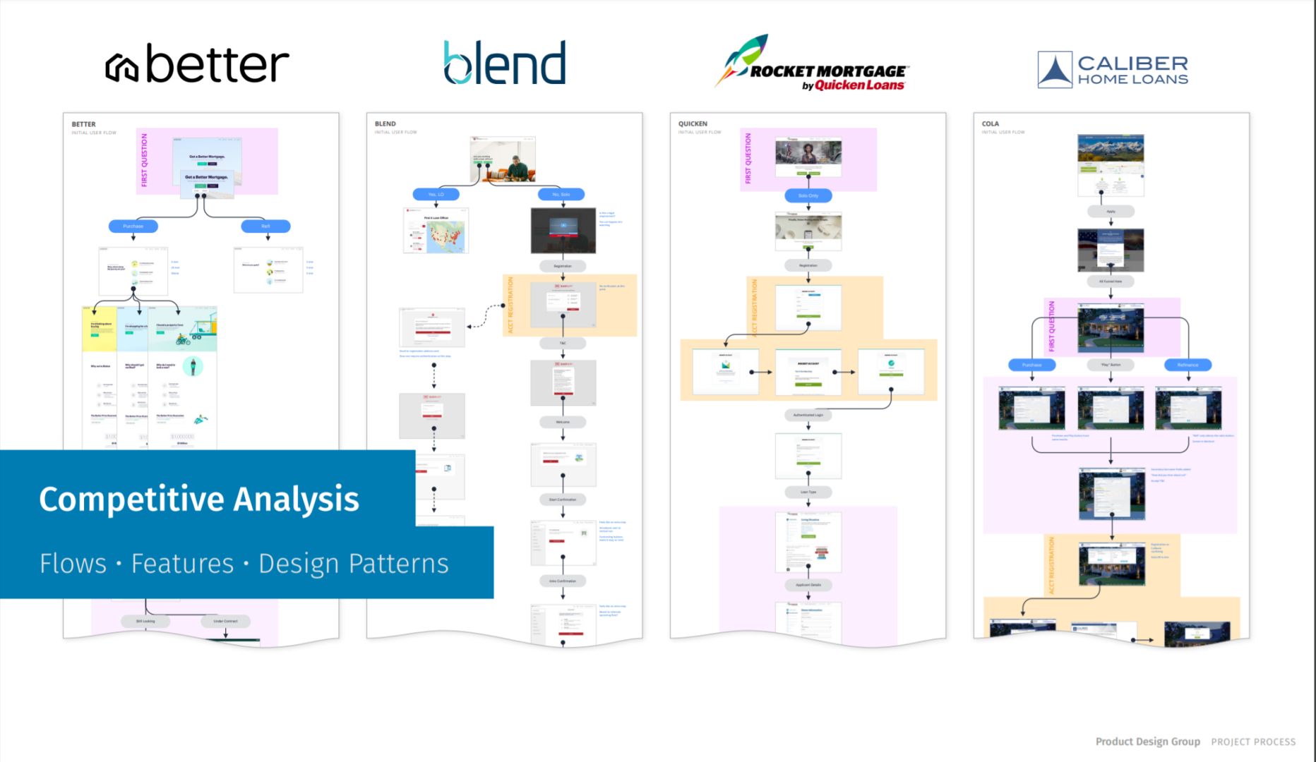
Discovery – Competitive Analysis
We could only go so far through the loan process without actually applying for a loan.
What we did learn is that our competitors made it easier to get started by delaying the account creation process till after a customer was already in the application.
This is important because we were asking for too much information up front, and losing a lot of people before they even created an account. Our theory was the faster you can get them into the application, the more likely they will successfully submit.
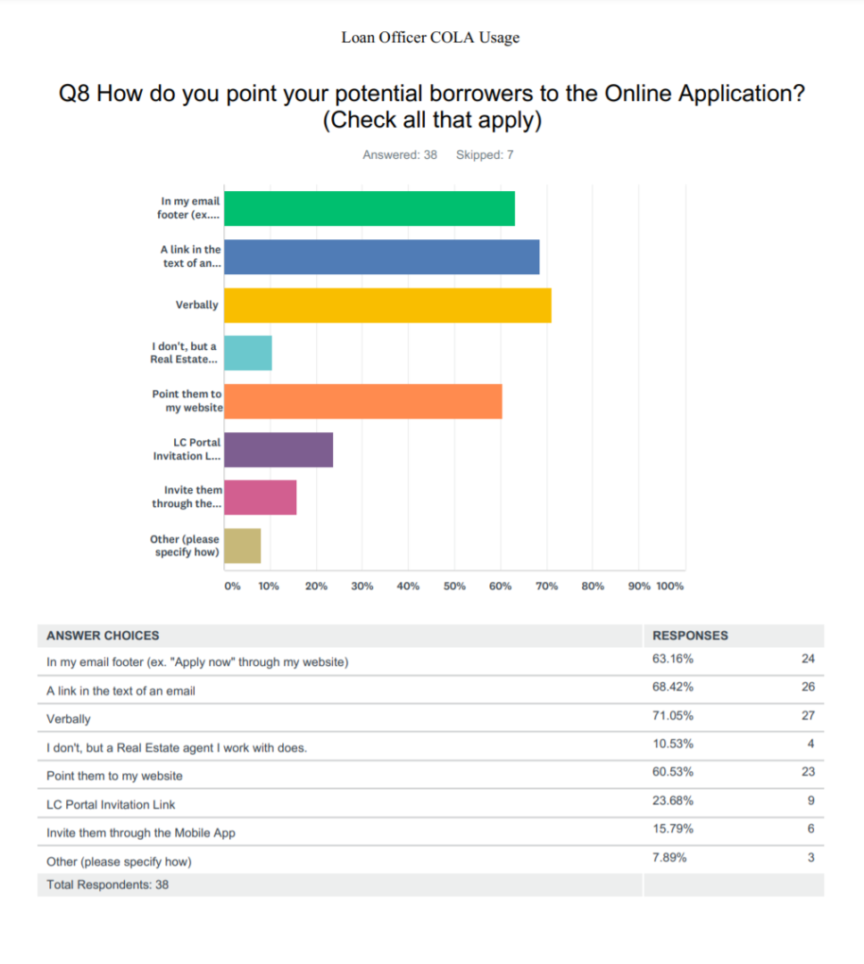
Discovery – User Observations and Survey
Our team went to three local retail offices to interview 15 Loan Officers about how they work with borrowers.
We learned a great deal about how the LO’s would direct borrowers to the portal to submit their application.
We also learned that some LO’s preferred to input the data for the borrowers and later send them a link to confirm the data and upload documents. This was potentially a high-value feature opportunity.
To learn more about the Loan Officer and borrower experience at scale we sent out a survey to help identify common pain points to later help with prioritization.
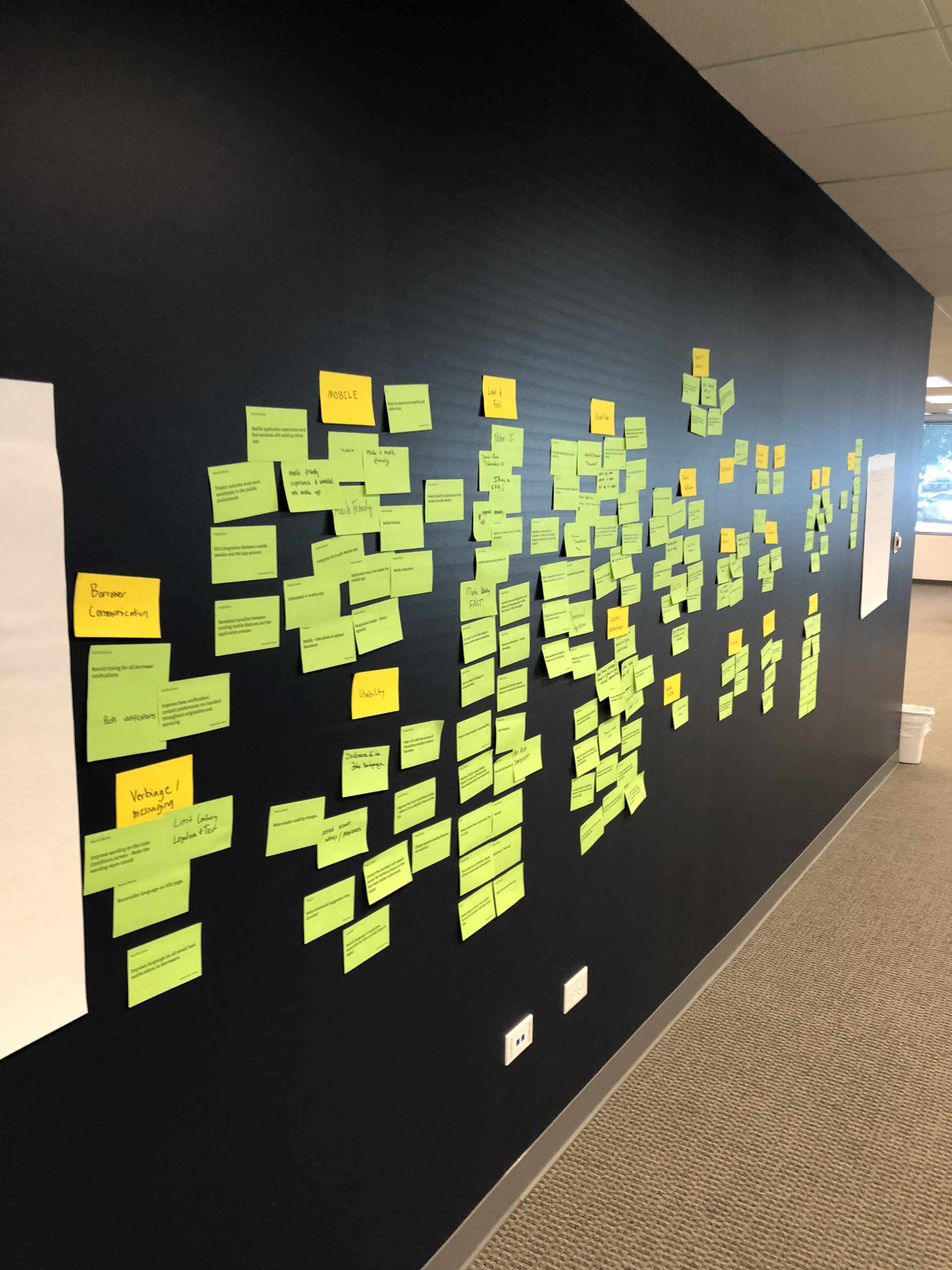
Discovery – Product Feature Prioritization
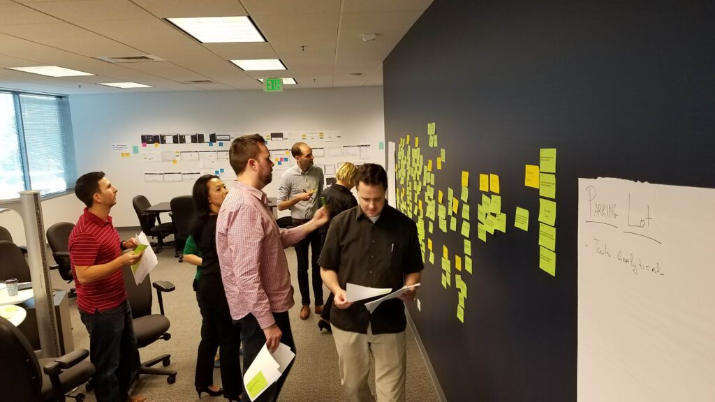
Remember when we could get together on site and collaborate? Remember actually putting sticky notes on a wall? Good times.
After we did all our discovery research we flew out key stakeholders, product management, analysts, and developers to get in a room for two days and layout everything they thought was important.
We walked the group through our discovery artifacts and showed them the compiled results.
We did affinity mapping, feature prioritization, story mapping and finally came out with a solid roadmap and plan of attack.
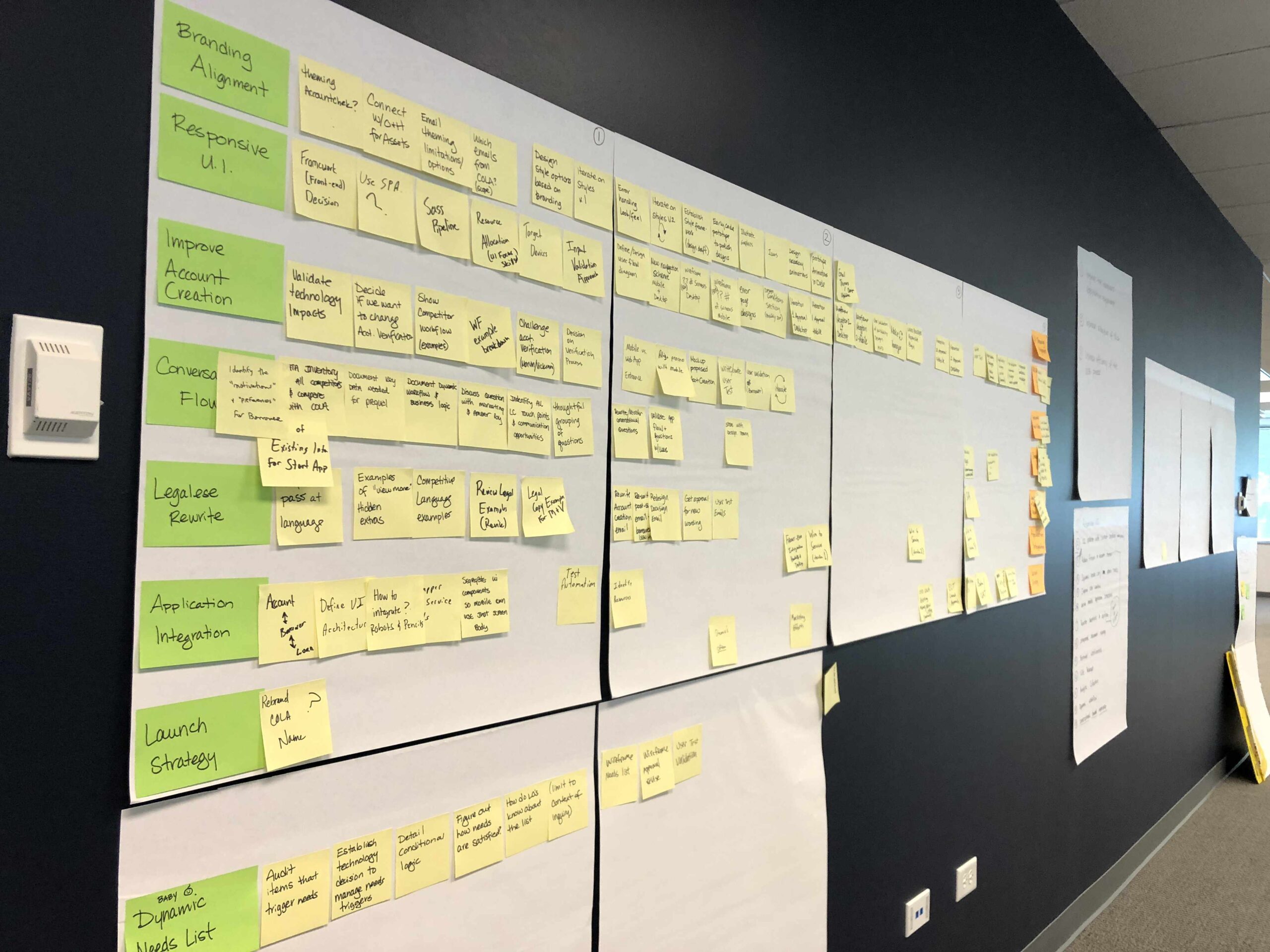
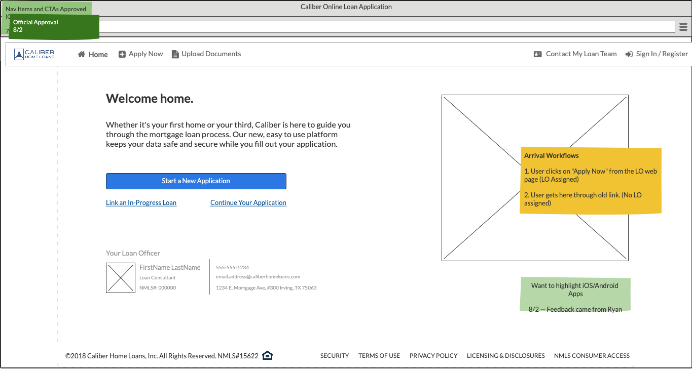
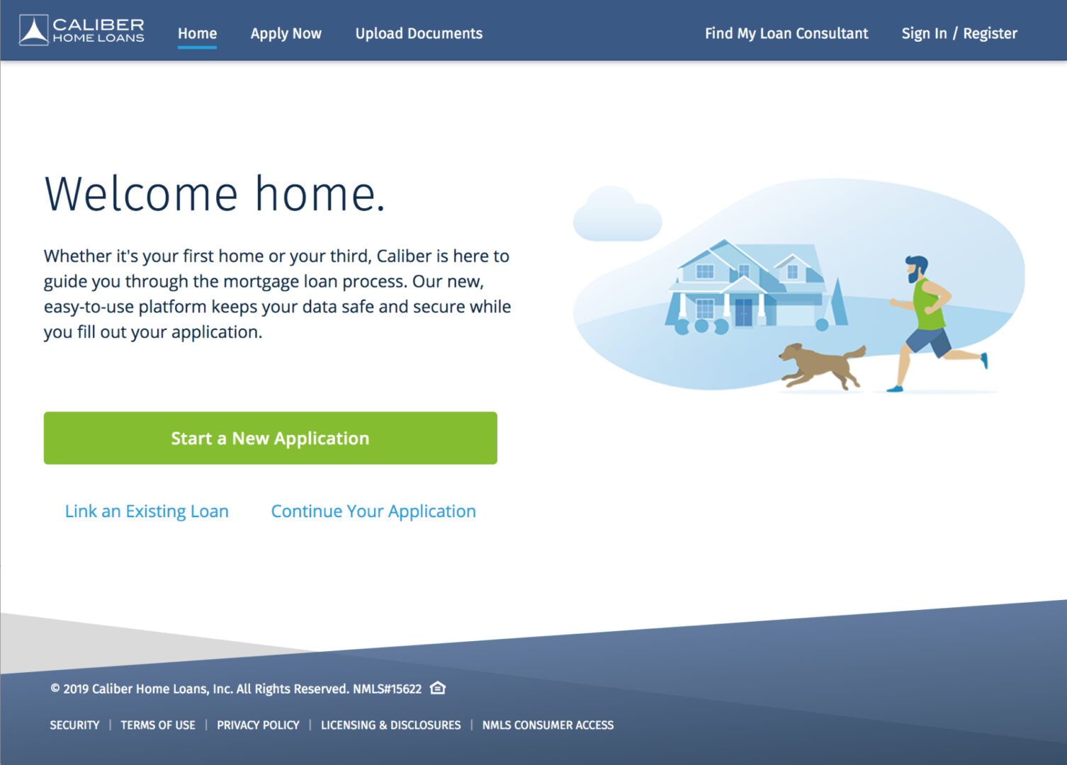
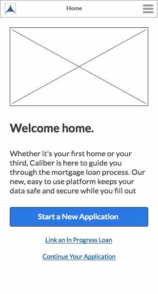
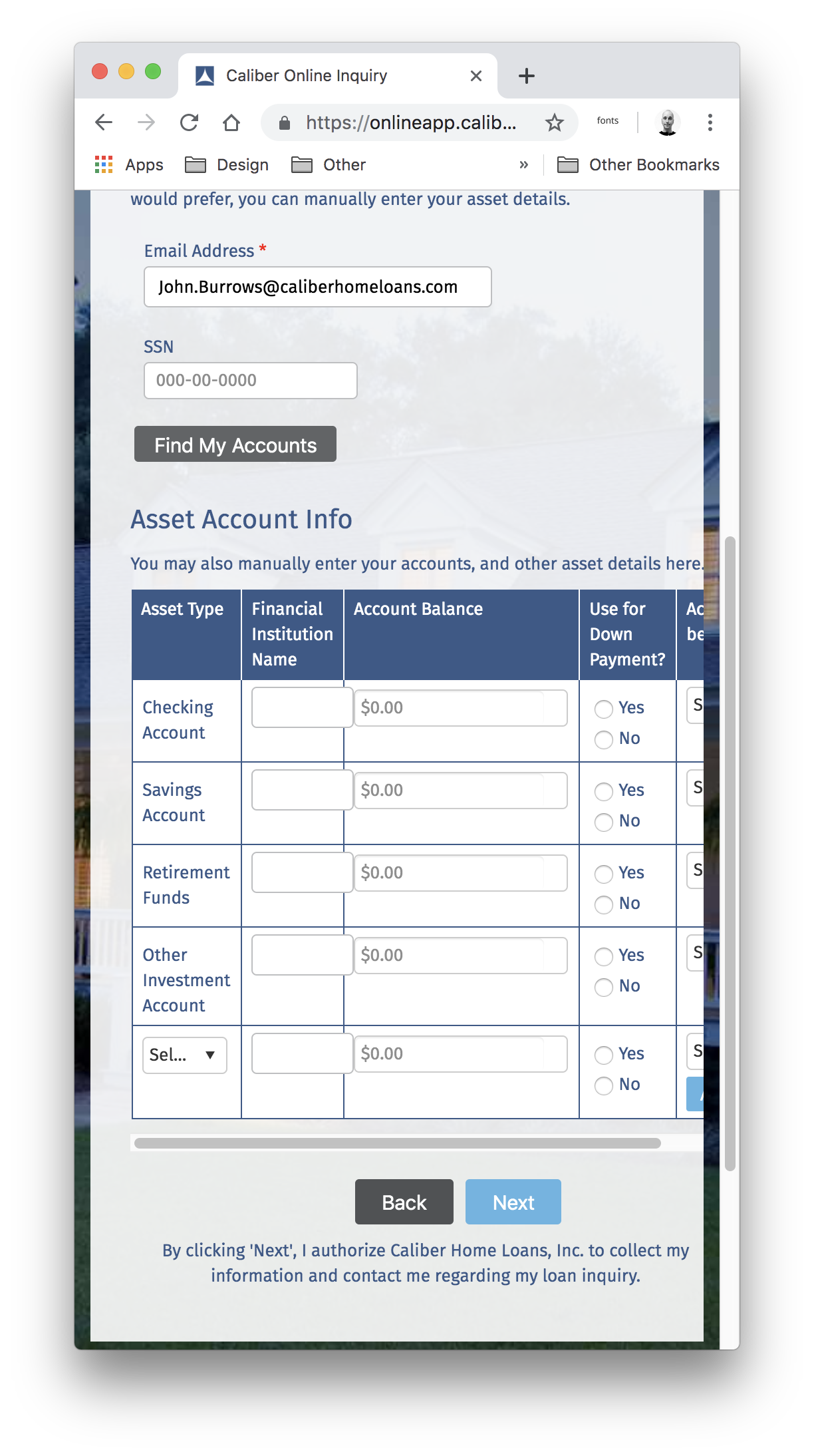
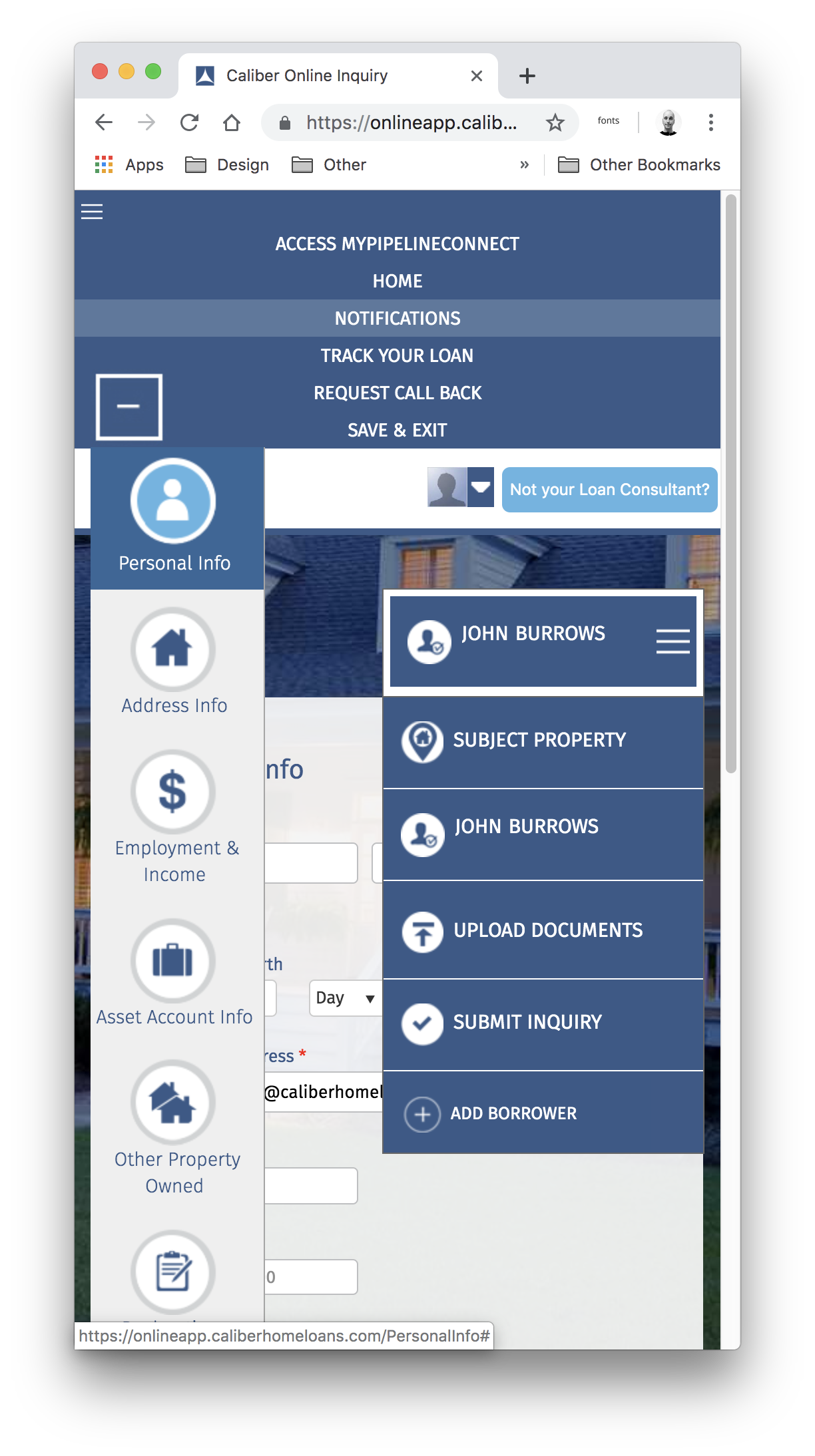
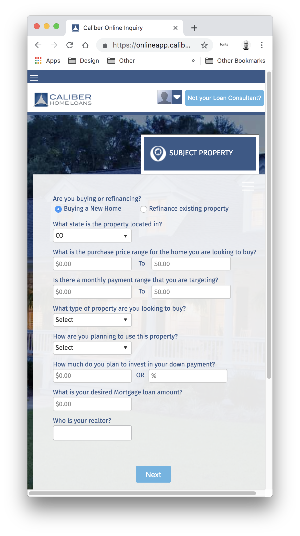
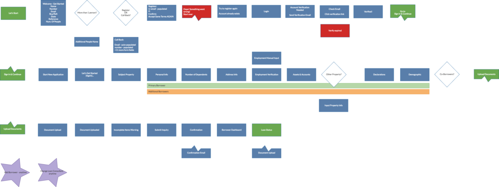
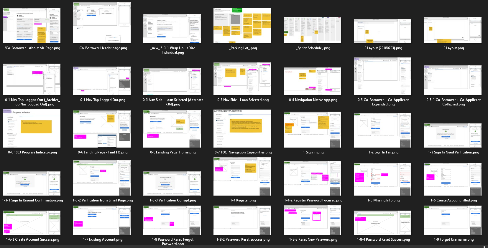
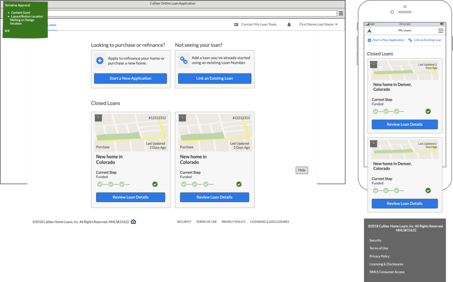
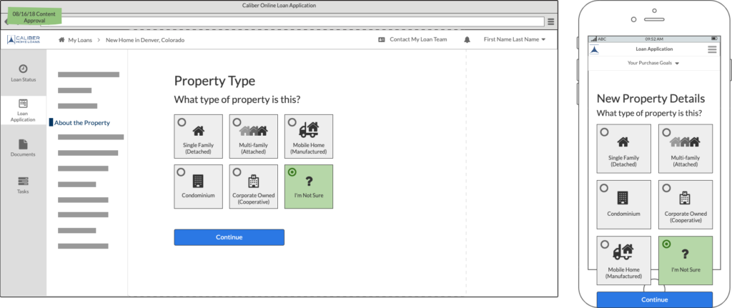
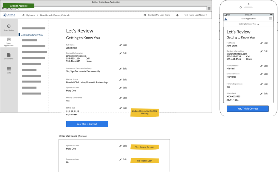
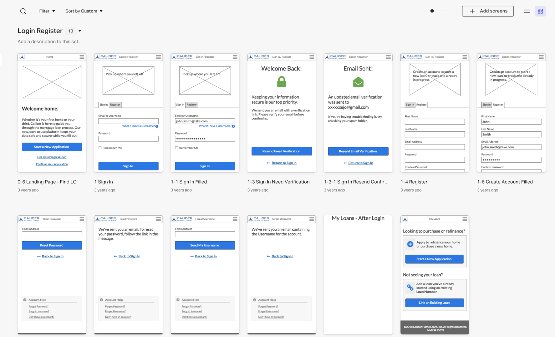
Wireframes
We had a short timeframe to design, but because of our research efforts I had a clear vision on how to execute.
I cranked out over 195 wireframes in about 2 months. Most of them having 2 to 3 design iterations based on feedback.
These were then used as the foundation for my colleague to begin exploring visual styles as well as for writing user stories for development to begin.
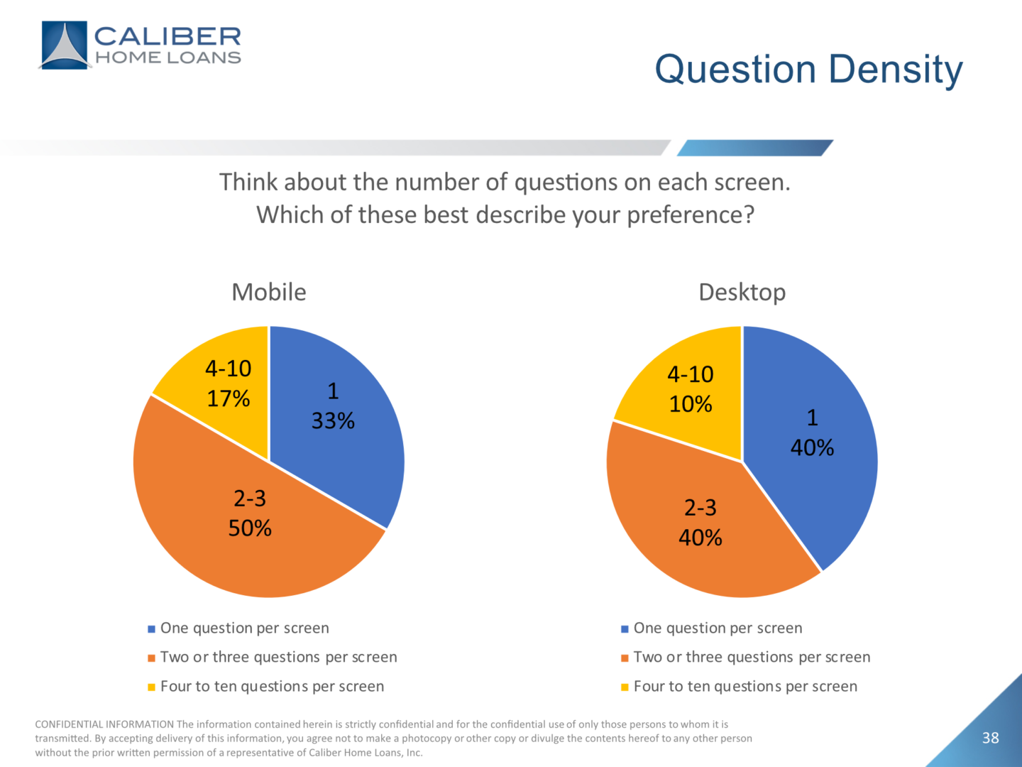
User Testing – Directional Feedback – Mobile Prototype
Although development had already started I wanted to validate some of the assumptions I had made within the designs.
I created an interactive clickable prototype in Invision to have users test and provide feedback. We wanted to see if the density of the questions was right.
I learned that users were fine with the one question per screen, but needed a way to visually indicate the progress they were making.
Post-Launch Usability Study
We did it! We successfully launched the new customer portal! (although it took 8 months longer than anticipated…) Of course we need to know what impact we made.
Overall we did a very good job, but a product is never perfect. What worked well? What did we miss? What can be improved? Oh boy, we had some nice surprises…
- 100% of users understood how to begin an application
- Most users utilized password strength helper text
- All users read at least the title for each section preview
- 72% of users read through section reviews at least once
- 100% of users encountered VOA errors
- Or encountered long load times (70 – 135 seconds)
- 100% of users that submitted app knew what to do next
- 81% of users prefer 1 to 3 questions per screen
- Uncovered critical IOS bug preventing people from starting application
- Uncovered confusion around Housing Info section – potential blocker
Result
- Launched the new portal, 8 months past the deadline (including all 14 features)
- Mobile first design made it possible to grow mobile adoption from 43% to 65%.
- 100% of users who started the registration process made it into the application.
- 92% of users submitted the application once they started
- Increased digital verification of employment to 85%, up from ~10%.
- Unfortunately digital verification of assets remains less than ~15%.
Things Learned
This product was a perfect example of doing all the right discovery research up front to make sure everyone understood what we were trying to solve and what the top priorities were.
As a team we set out to show an example of how a user centered design process can benefit everyone involved with creating software.
Every person we collaborated with became an ally and an evangelist for what we were trying to establish within Caliber.