
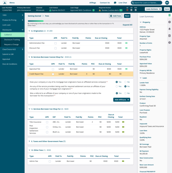
Loan Origination System
My Role
Principal UX Designer & Manager
- Strategy
- Direction
- Research
- Wireframes
- High Fidelity Design
- User Testing
Other Team Members:
- 1 Principal UX Engineer
- 5 Sr. Product Designers
- 3 Jr. Product Designers
- 3 Product Managers
Time Frame
2020: 22 Months
Tools
- Balsamiq Online
- Figma
- UserZoom
Background
Caliber’s loan origination system (LOS) has been the backbone of all loan processing and underwriting. It was a very powerful system built over 15 years to be able to underwrite and service any type of loan product for any type of customer.
There are very few systems capable of doing what this LOS does. Like many mature products, this one had become monolithic and tightly entangled with itself.
We aimed to re-architect the system from the ground up to leverage a modern tech stack including modern REST APIs to improve response time and scalability.

Goals
- Reduce training time
- Increase capacity of loans through the pipeline
- Decrease time per loan
- Decrease time to closing
- Automate parts of loan process
- Decouple monolithic loan origination system using modern tech stack
- Streamline information on screen relevant to each user role
Problems to Solve
- Consolidate each role process into a standard process
- Identify loan data relevant to each role’s task
- Reduce screen complexity
H2O was trying to be all things to all users at all times. This resulted in a lot of clutter on the screen and multiple ways of doing similar tasks. This became an issue of time whenever a specific area received an update it wasn’t a guarantee that all other areas received the same update.
With the new system we wanted to build a shared core component library that all channels and users could leverage, reducing duplicative work and reducing effort to maintain code.
Summary of Activities
- Define Research & Discovery Plan
- Understand Stakeholder Goals – 26 Stakeholder Interviews
- Conduct User Observations -21 User Observation Sessions
- Deploy User Survey – 1070 Survey Responses
- Define User Personas
- Define Measurable Outcomes
- Identify Analytic Needs & Gaps
- Define Plan for Analytic Integrations
- Document User Journeys
- Competitive Analysis
- Low Fidelity Wireframes
- Directional User Testing
- High Fidelity Designs
- Ongoing Usability Studies
- Measure Impact – Customer Feedback & Analytics
- UX Recommendations & Iterations

Research & Discovery
Discovery Plan
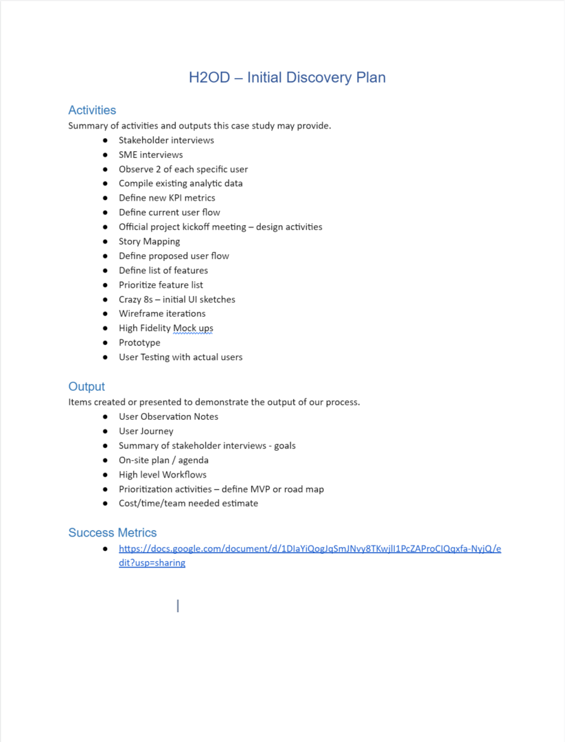
The first thing I always do is make a plan on which research activities the team will execute and what type of deliverables we should expect.
Stakeholder Interview Template
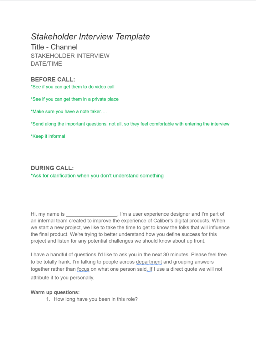
One of the most important elements is understanding who the stakeholders are and what they believe is vital for the project to succeed. I wrote an interview script template so we could divide the interviews across multiple designers to quickly complete.
We conducted 26 stakeholder interviews across 5 product channels. With that information we were able to compile a list of common pain points and user needs.
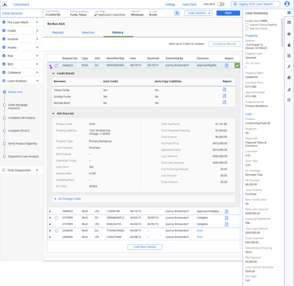
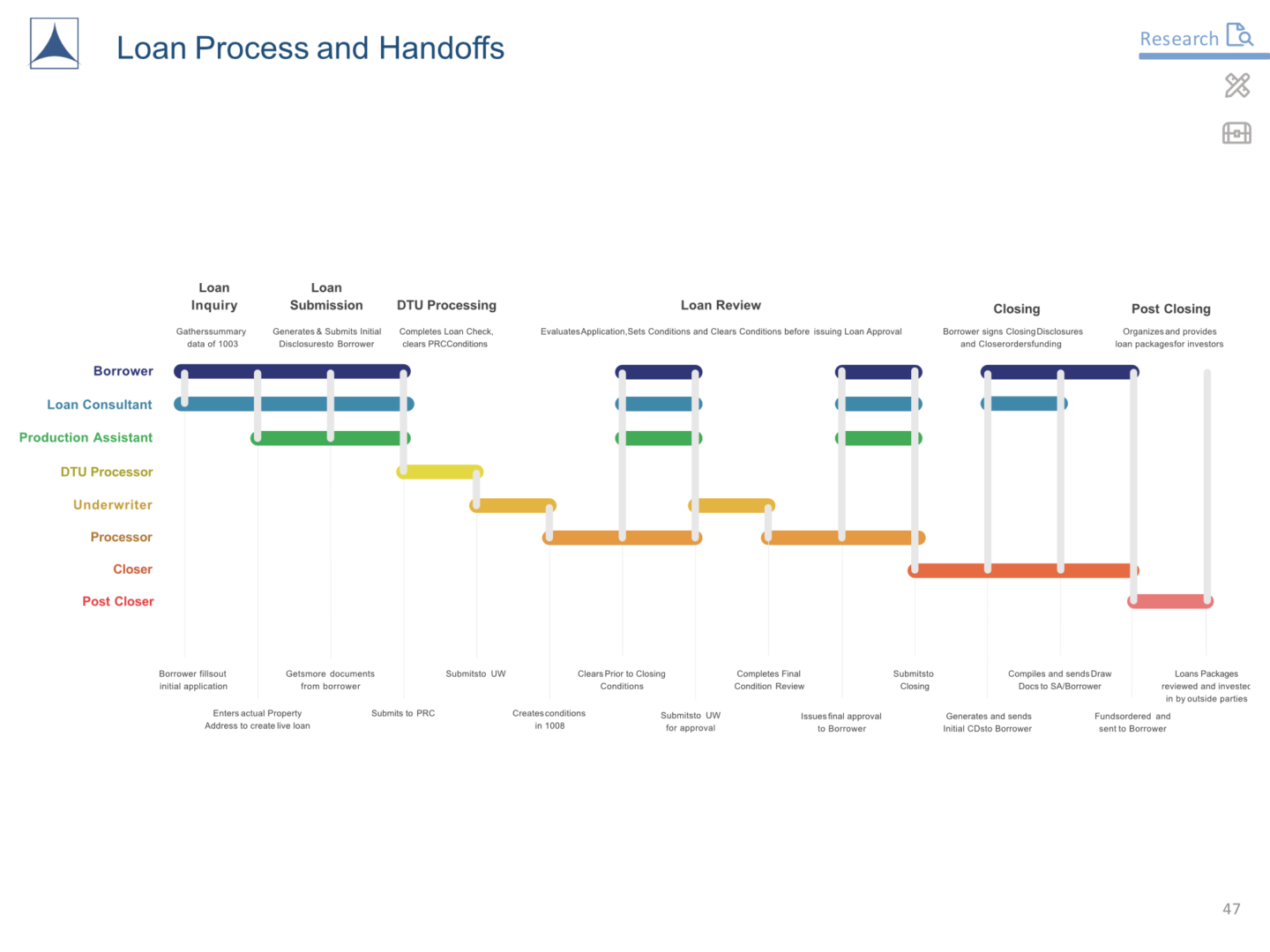
Loan Process & Hand-offs
From our user research we mapped out a high level of all the loan touch points throughout the life of a loan. I affectionately refer to it as the loan subway map. We used this to visualize the high-level loan process and all the potential crossover between roles and customers.
User Interviews and Observations
We then interviewed and observed 21 users. Two people from each role to understand the work from their perspective. We later reviewed these flows with their management to make sure there weren’t any gaps.
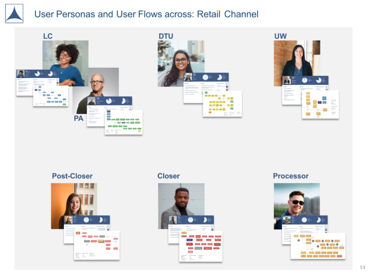
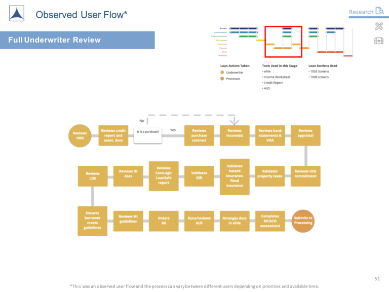
Diagrams by Scott Compton and Jesse Morgan
Research at Scale
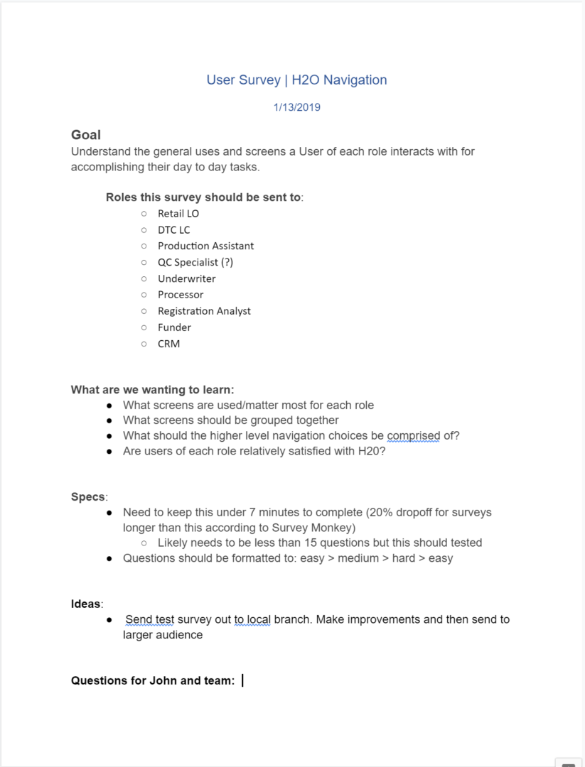
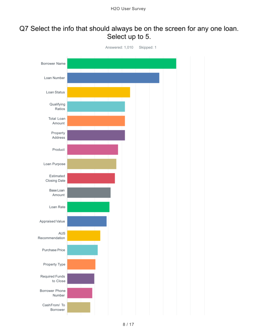
With our initial research we now had more questions that needed answers so we deployed a survey to over 1000 additional users across the company. I wrote a list of survey questions to be sent to all employees within operations.
The results from the survey showed some patterns around what data was most valuable broken out by roles.
User Survey Plan
User Survey Report
What was Important to Our Users
With our research we were also able to establish the project goals and expectations that could be shared across numerous stakeholders across many channels.
This also made it clear that each role within the company had different priorities of information depending on what they were trying to accomplish. We would need our system to be flexible in how it delivers loan data.
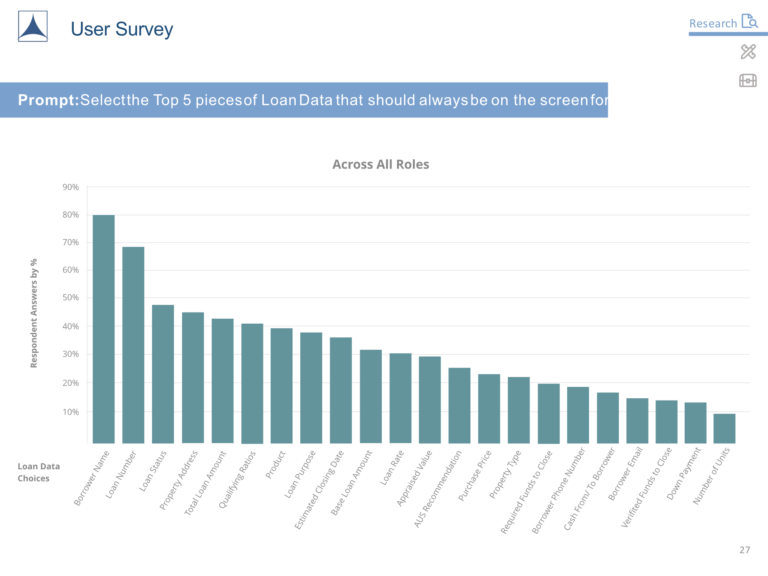
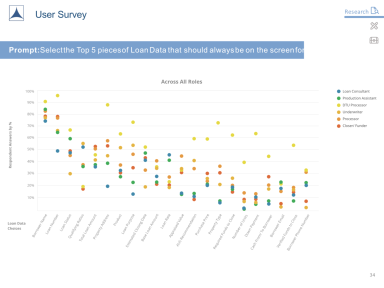
Charts created by Scott Compton
Initial Low-Fidelity Wireframes
With initial research complete it was time to wireframe some initial concepts so we could get user feedback. These wireframes would be a significant departure from the original application which underpinned the importance of getting user feedback as early as possible.
I wanted to do some explorations on giving users customizable views.


Initial User Testing
We conducted a moderated user test with 12 participants. This was right before covid hit so we were able to conduct this test on-site and gather ethnographic research as well.
It provided us with high-level directional feedback confirming some things we had planned but more importantly a list of additional areas that were unclear to test participants.
User Test Plan
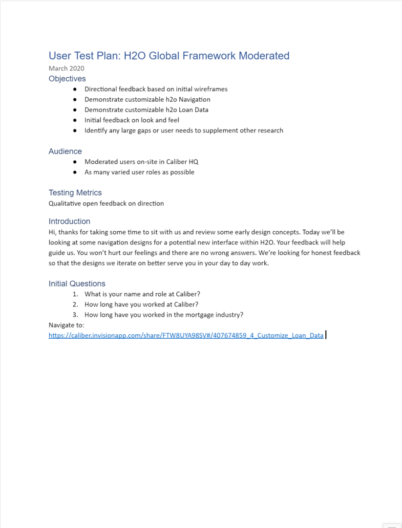
Test Summary

Competitive Analysis
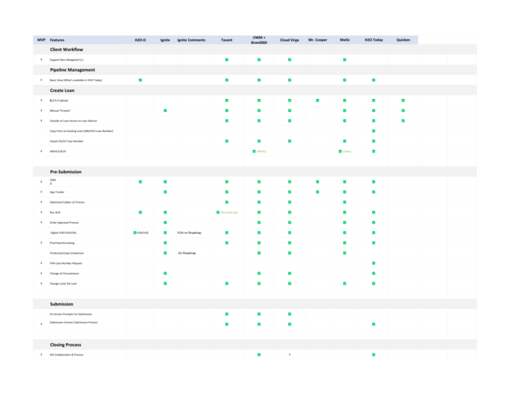
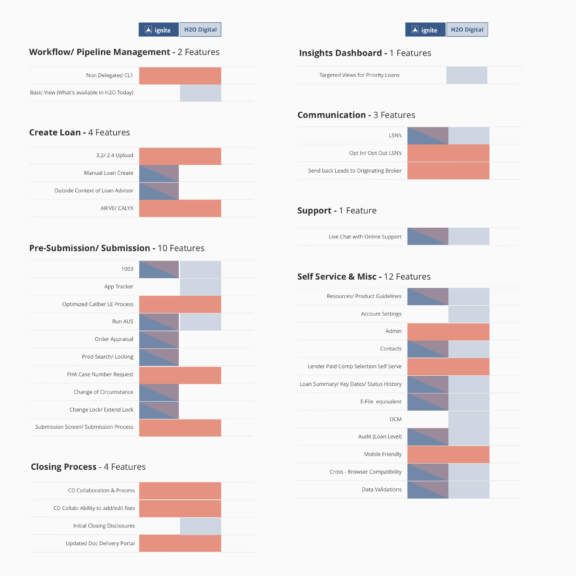
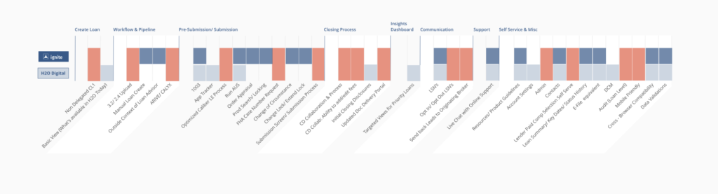
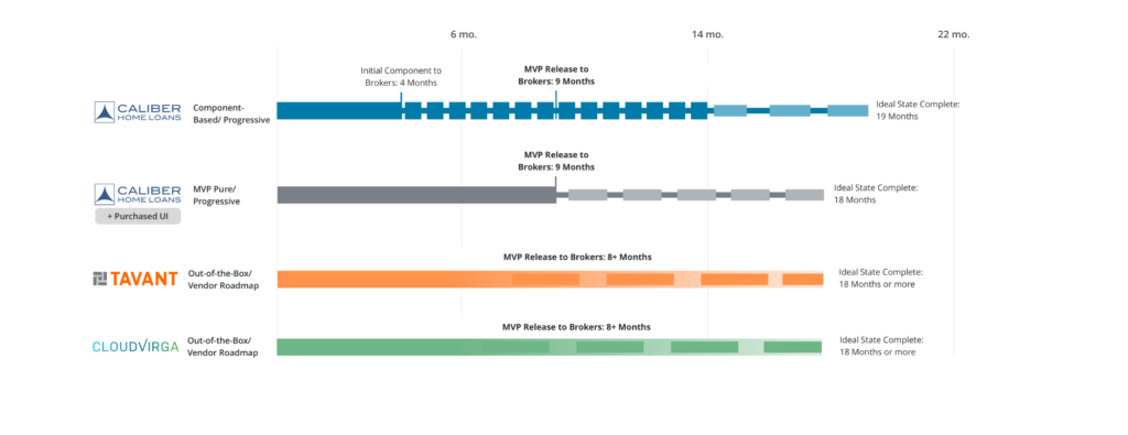
In order to fund this product we first needed to understand exactly where we stood with our biggest competitors. This would also identify any potential gaps so we could form a plan of approach.
I worked with product management to put together a feature matrix to visually indicate coverage and needs. Based on this exercise we then made a plan for what an MVP would be and how quickly we could launch.
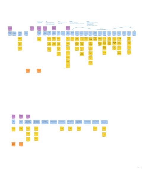
Story Mapping and Feature Prioritization
It was now time to decide where we should start and also define a roadmap. Usually this would entail flying everyone to the office for a 3 days to participate in a workshop, but this took place in March of 2020 right after the pandemic lockdowns went into place.
Instead of meeting in person I conducted my first ever remote-led workshop. The major challenge was how to keep a large group of people engaged in a virtual environment using tools none of them were familiar with.
I opted to use Miro and put together an activity to get everyone logged in and confident in navigating the tool.
After a couple of days we knocked out the overall flows for major parts of this new product.
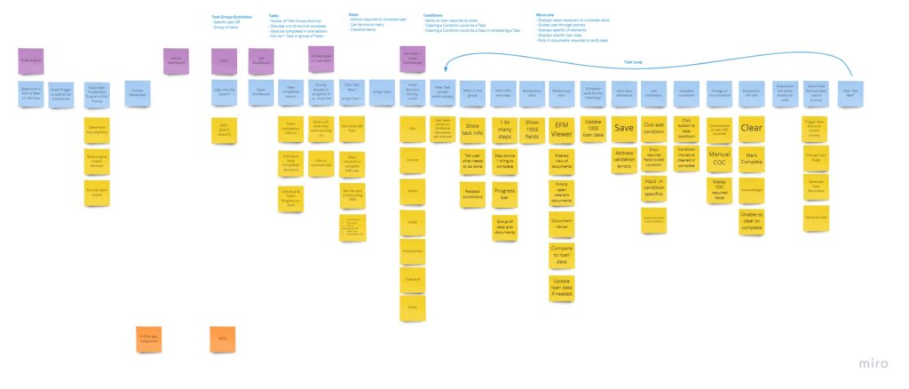
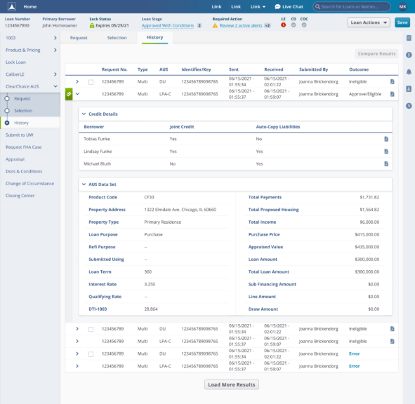
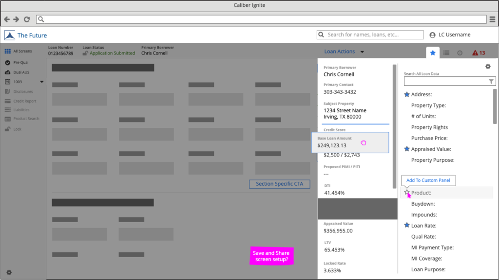
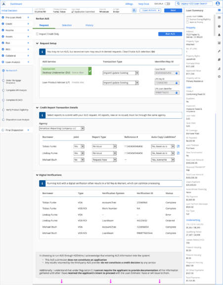
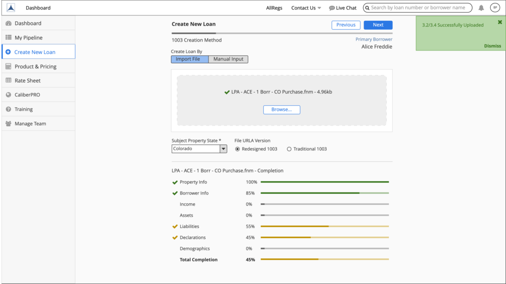
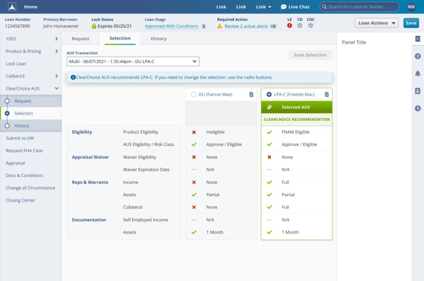
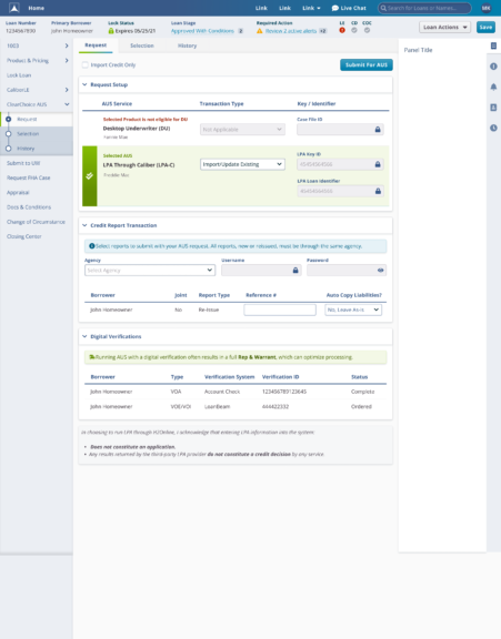
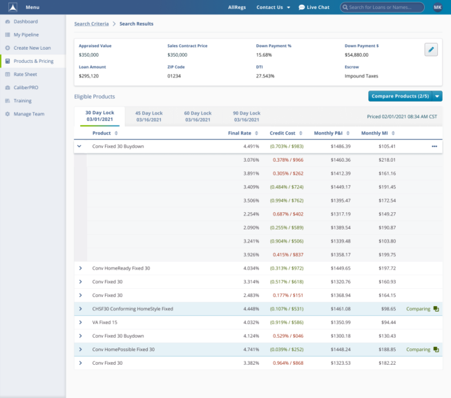
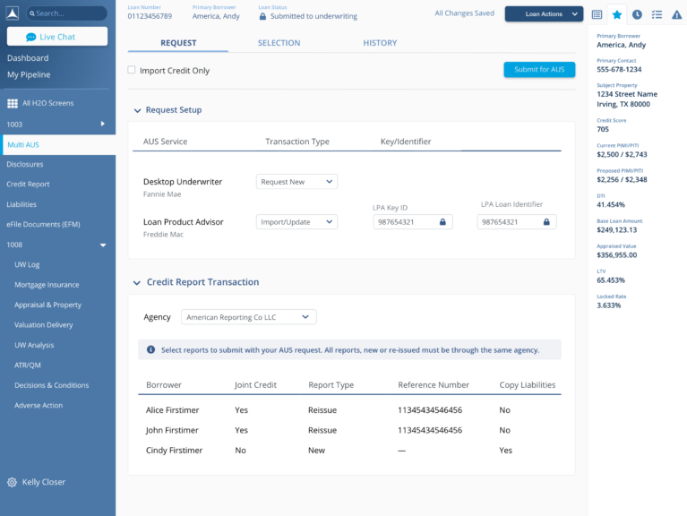
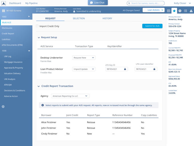
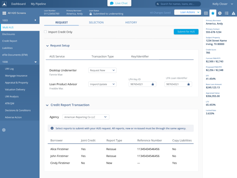
Mid-Fidelity Wireframes
With a solid direction and roadmap in place we begun wireframing the various flows and interactions. This is when I brought in 3 additional designers to help take on different features. Between the 4 of us we designed well over 500 screens supporting 9 development teams.
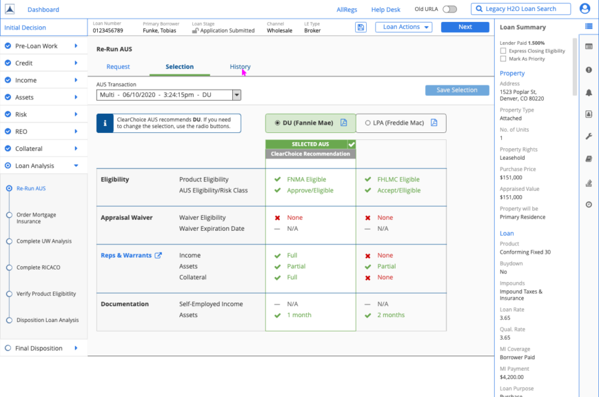
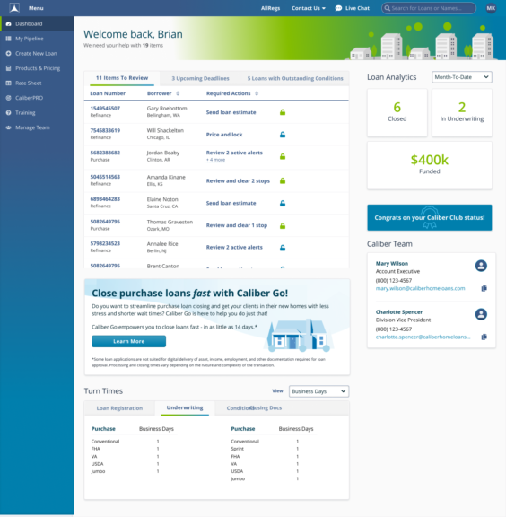
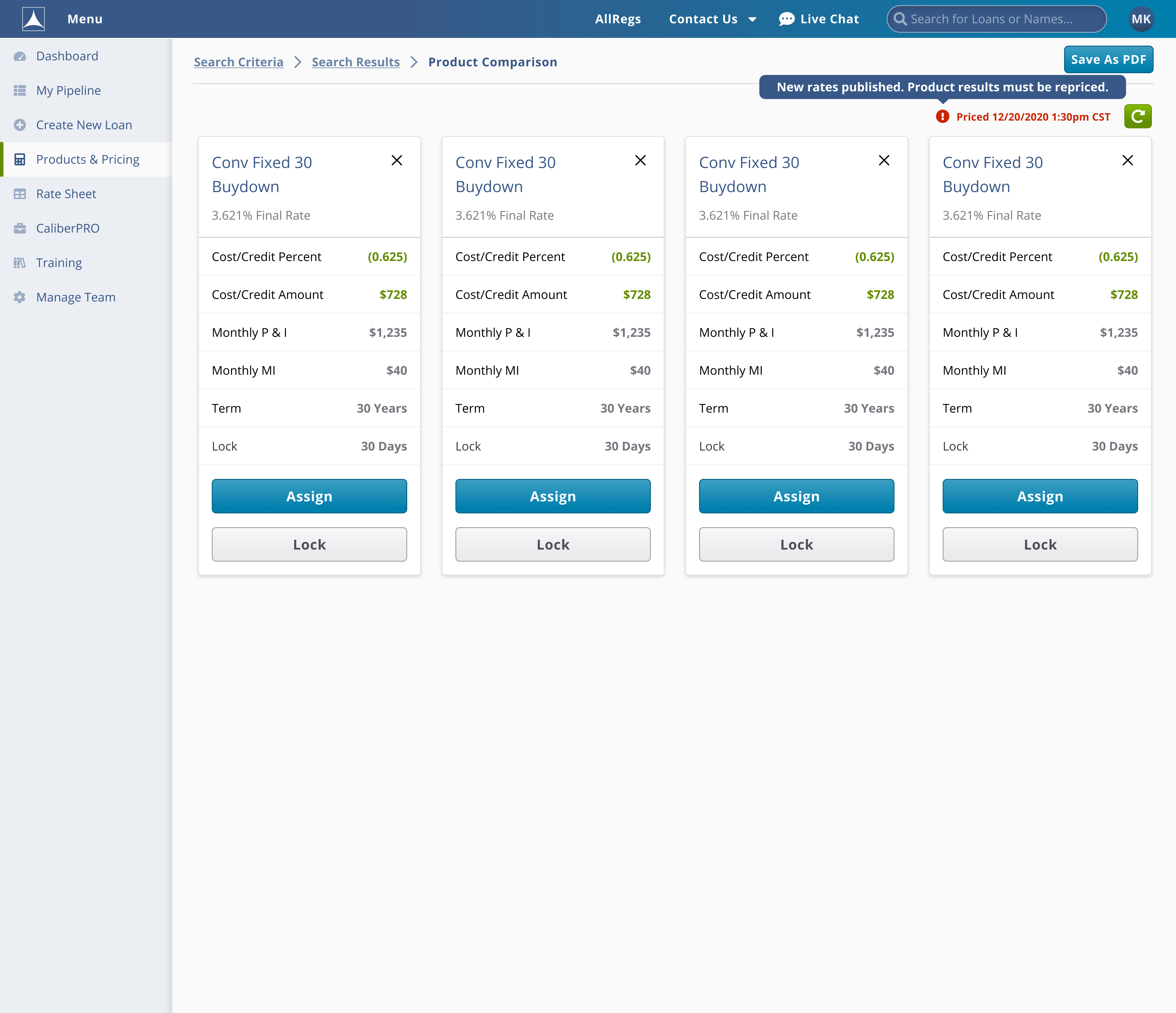
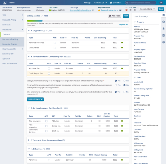
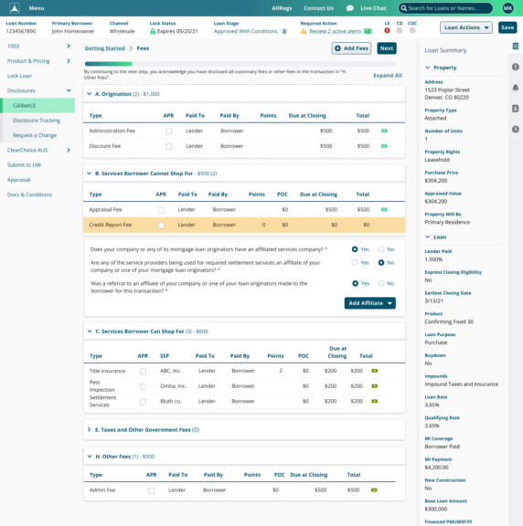
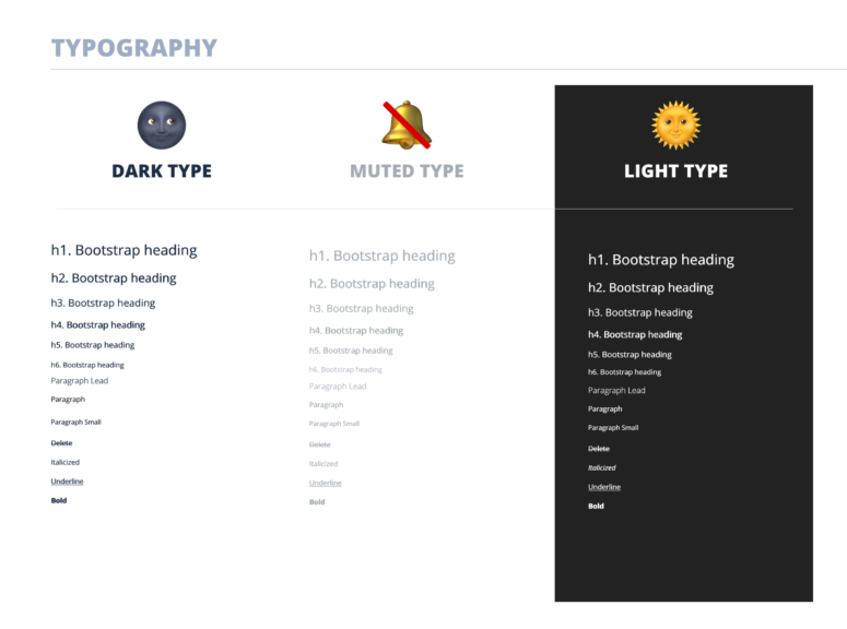
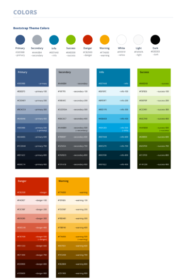
High-Fidelity Mockups
Once we had several iterations and reviews we began to do high-fidelity mockups. First we started with visual explorations for theme’s using colors and typography.

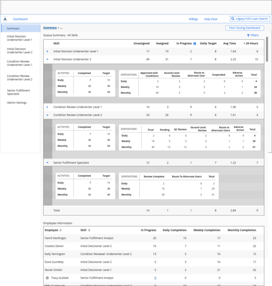
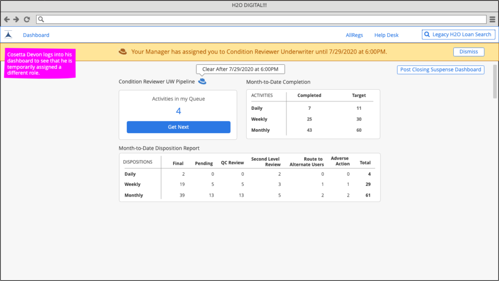
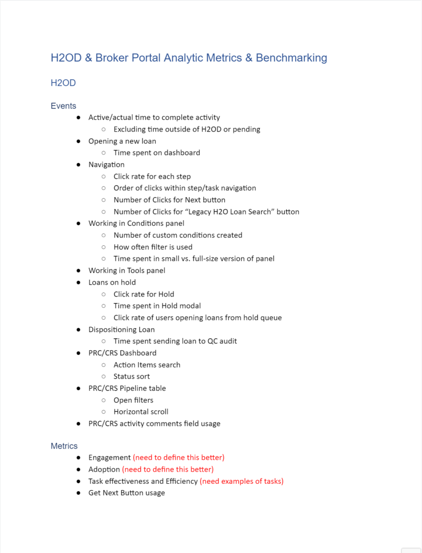
Analytics and Measurements
As were designing the screens we knew that it was vital to measure the impact these updates might have. With the collaboration of our product management we brainstormed a list of metrics that we needed to get implemented.
We had three large buckets that we aimed to improve:
- Capacity
- Cost Per Loan
- Cycle Time
Most of our metrics were more granular ways to measure interactions that supported those 3 large buckets. We also wanted to understand how users were leveraging features within specific areas of our products.
As a team we would capture every type of metric we thought we might want to track. We broke them out by Events, Metrics, Usage, and User Tests.
We then worked with development to get them integrated within our products using Amplitude and later FullStory.
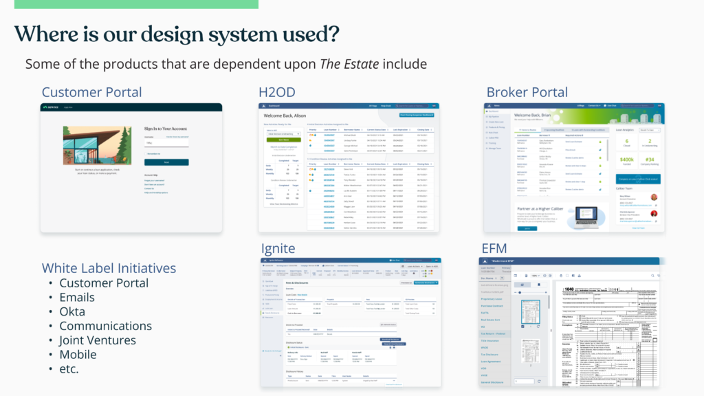
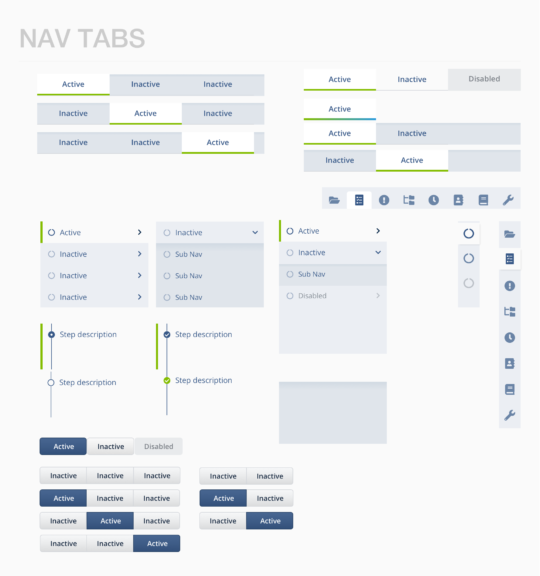
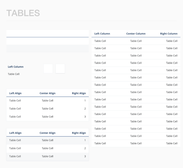
Core Components & Design System
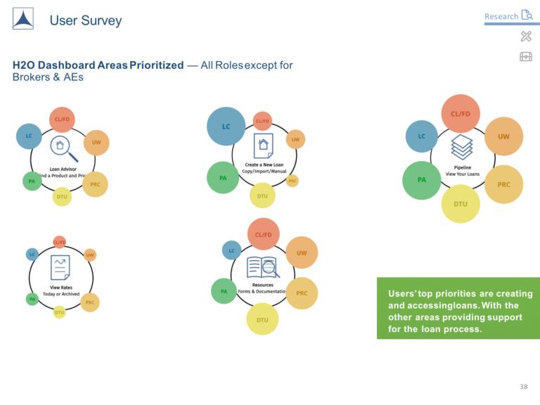
H2O supported several different channels each with their own goals and processes. Although they were unique, most of their data needs were shared within the system.
We needed to make sure that what we were designing could be flexible to fit different use cases. To help ensure consistency we built a design system for each channel to use the same components and design patterns.
This allowed us to scale the feature work across 12 designers embedded in 5 product teams.
The design system leveraged Bootstrap 4 as it’s framework, but we leveraged a lot of design patterns from Material.
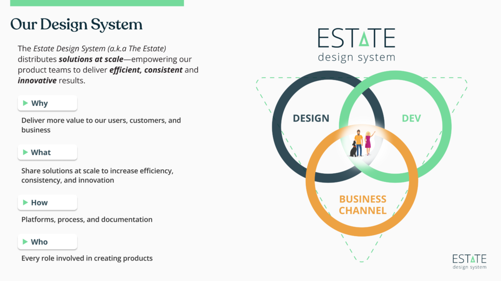
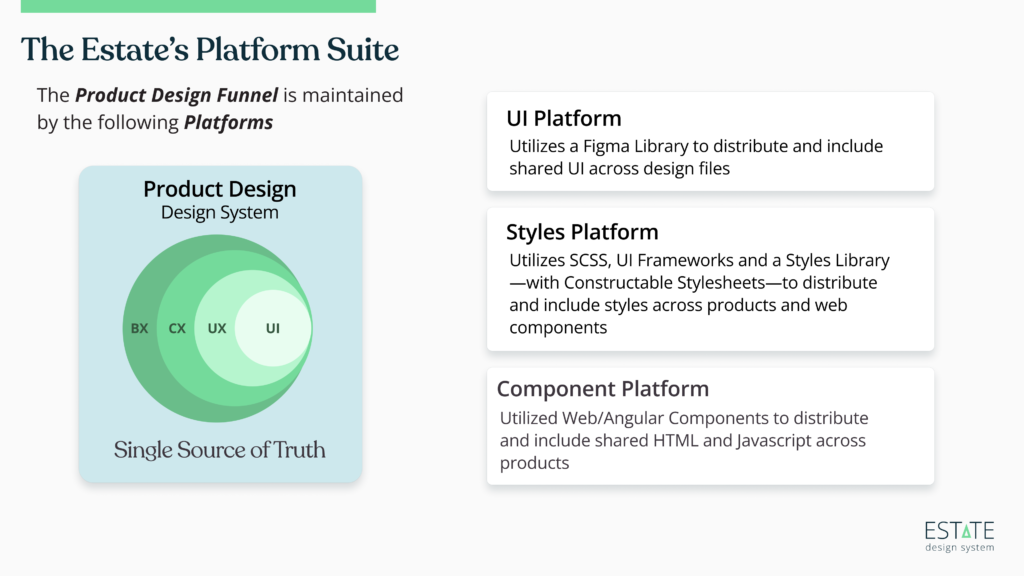

Thanks to Mike Bowlin
Outcomes and Next Steps
With something as large as this group of products there is no “end” in a traditional sense. From initial research to launch we only had 4 months to get a very rough MVP out to users and start gathering feedback.
Over the following 18 months there were several iterations and improvements. Along with that was a list of additional user testing and validation which I helped my teams prioritize and carry out.
- Launched MVP in only 4 months
- Scaled design team from 4 to 15
- Directed the deployment of 40+ usability tests
- Integrated analytic tracking across 4 product pillars
- Introduced a design system and shared core components
- Rebuilt entire loan origination system
- Reduced processing time by 18%
- Reduced time to close by 7 days
Special Thanks
Something as large as this involves a lot of work by several skilled colleagues. I’d like to thank the following:
- Scott Compton
- Zach White
- Mike Bowlin
- Kellie McDonald