VL Design System
My Role
Principal UX Designer & Manager
- Direction
- Audit
- Organization
- High Fidelity Design
- Governance
Time Frame
3 Months
Tools
- Figma
- Material Documentation
Background
Visual Lease is an enterprise financial-technology SaaS product used by accountants. Their product was undergoing a complete rebuild from their original monolithic platform onto a modern tech stack.
When I joined Visual Lease there had been several contract designers over the previous years so there were no established processes or design system in place. I was brought in to enact a user centered design practice as well as stand up a design system.
This case study focuses solely on the design system.
Goals
- Leverage Figma to provide shared libraries and auto-layout components
- Build a flexible design component library to meet customer, designer, developer needs
- Adhere to the best practices of Angular Material framework
- Ensure consistency of design mockups across all designers and feature work
- Reduce time to produce mockups
- Streamline development by providing components that align with their code components
- Level up junior ux designers’ skills within Figma
Challenges
- Multiple designers using Adobe XD
- Stagnant static design system without shareable components
- Inconsistent mockups from each designer
- No sharing of common design patterns
- Rebuilding components each time or copy/paste between files
- Inconsistent color, typography, padding, margins, and button usage
- Time to produce mockups took 1 – 2 weeks
- Difficult to update based on feedback
- Difficult for stakeholders to provide feedback
- Impossible to find older designs
Summary of Activities
- Heuristic evaluation of current VL product
- Identify design patterns in use (or misuse)
- Identify and prioritize areas of potential usability risk
- Audit current dev implementation of colors, typography, forms, buttons, etc…
- Ensure AAA accessibility standards for color, contrast and font size
- Define base color & typography tokens for design system
- Theme Material UI components using tokens
- Adjust atomic components to fully leverage auto-layout
- Define component usage and design patterns
- Build out common VL components for common design patterns
- Define plan to update existing platform components in code
Heuristic Evaluation


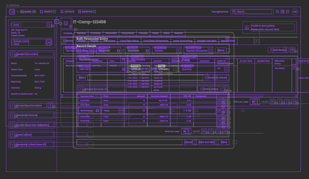
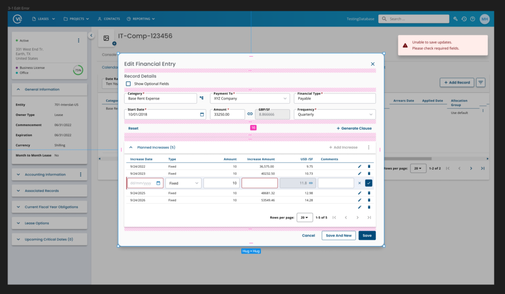
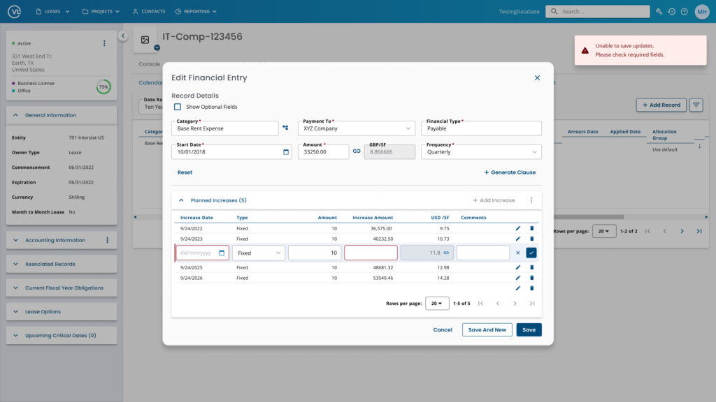
First thing we did as a team was go through every section of the application and note usability issues and concerns. We mapped these to 10 common ways of measuring heuristics along with assigning them a severity score. Items scored “5” would be critical to fixing asap. Fortunately there weren’t many of those to be found.
Along with the scores we included themes, UX recommendations, and a link to view screenshots in Figma to visualize what we were referring to.
Having all this information allowed us to prioritize design patterns within our design system to focus on first.
Audit Current Dev Implementation
Colors, Typography, Form Inputs, Buttons, etc…
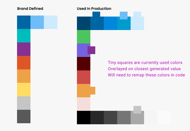
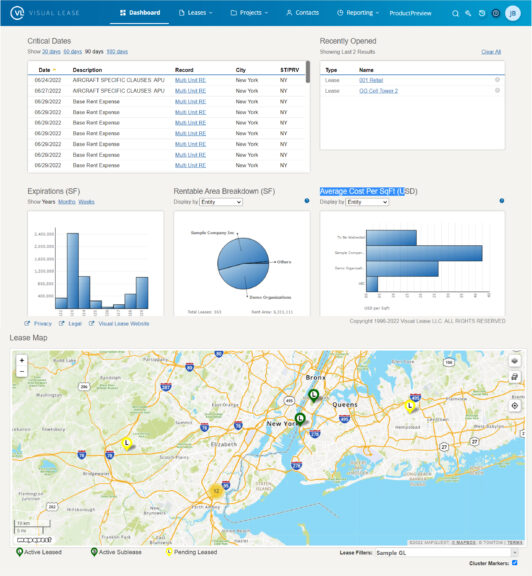
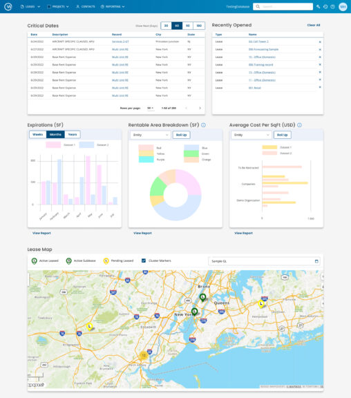
The next thing I did was audit how colors, typography, and the information architecture were currently implemented within production. I wanted to see how many variations were in use and whether they lined up with marketing brand guidelines (spoiler, they weren’t).
I used highlights to visually indicate how the information architecture was inconsistent across several screens
Ensure AAA Accessibility Standards for Color, Contrast and Font Size
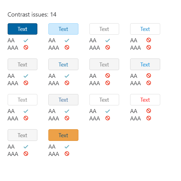
I wanted to understand where we had contrast issues to make recommendations on updating the existing styles to be AAA compliant.
This also tied into some customer feedback we had received regarding legibility and eye strain.

My audit showed there were 15 variations of font sizes in use within the product and implementation was inconsistent.
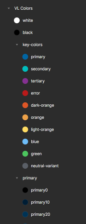
Define Base Color & Typography Tokens for Design System
Theme Material UI Components Using Tokens
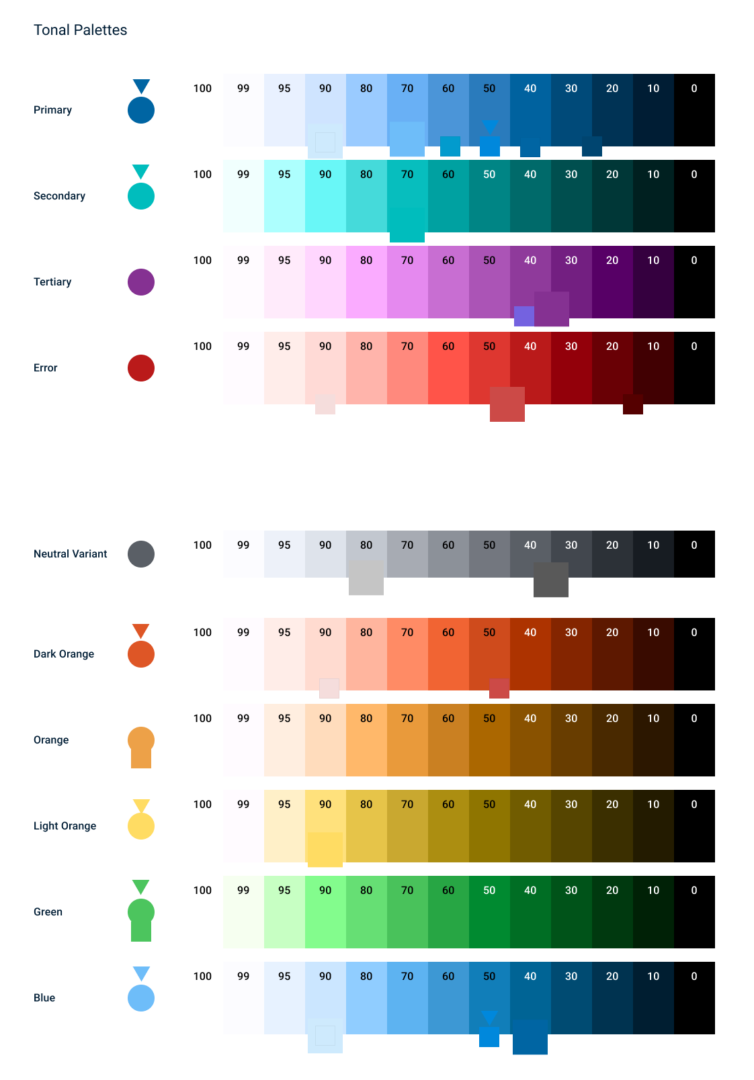
It didn’t appear as though there was any systemic approach to how the existing system arrived at the current decisions. I wanted to make sure that we started with a solid foundation of color and typography tokens.
Using marketing’s base defined colors I used Material’s own palette generator plugin to expand our color system. This allowed us to stop “fighting” the framework and begin a systematic approach to color contrast.
I then remapped existing colors to the closest swatch within the generated color palette.
Typography Scale & Tokens
I wanted to reduce the number of font options and also make sure that they scaled in a way that was easier to leverage within an enterprise app. The default text styles for Material include some sizes that are not usable for our purposes.
I used type-scale.com to define the sizes we would need so we could consolidate the 15 variations down to 8 levels of typography. Having fewer sizes would help better define the information architecture within each screen.
We now had our base color and typography tokens to start our design system foundation.


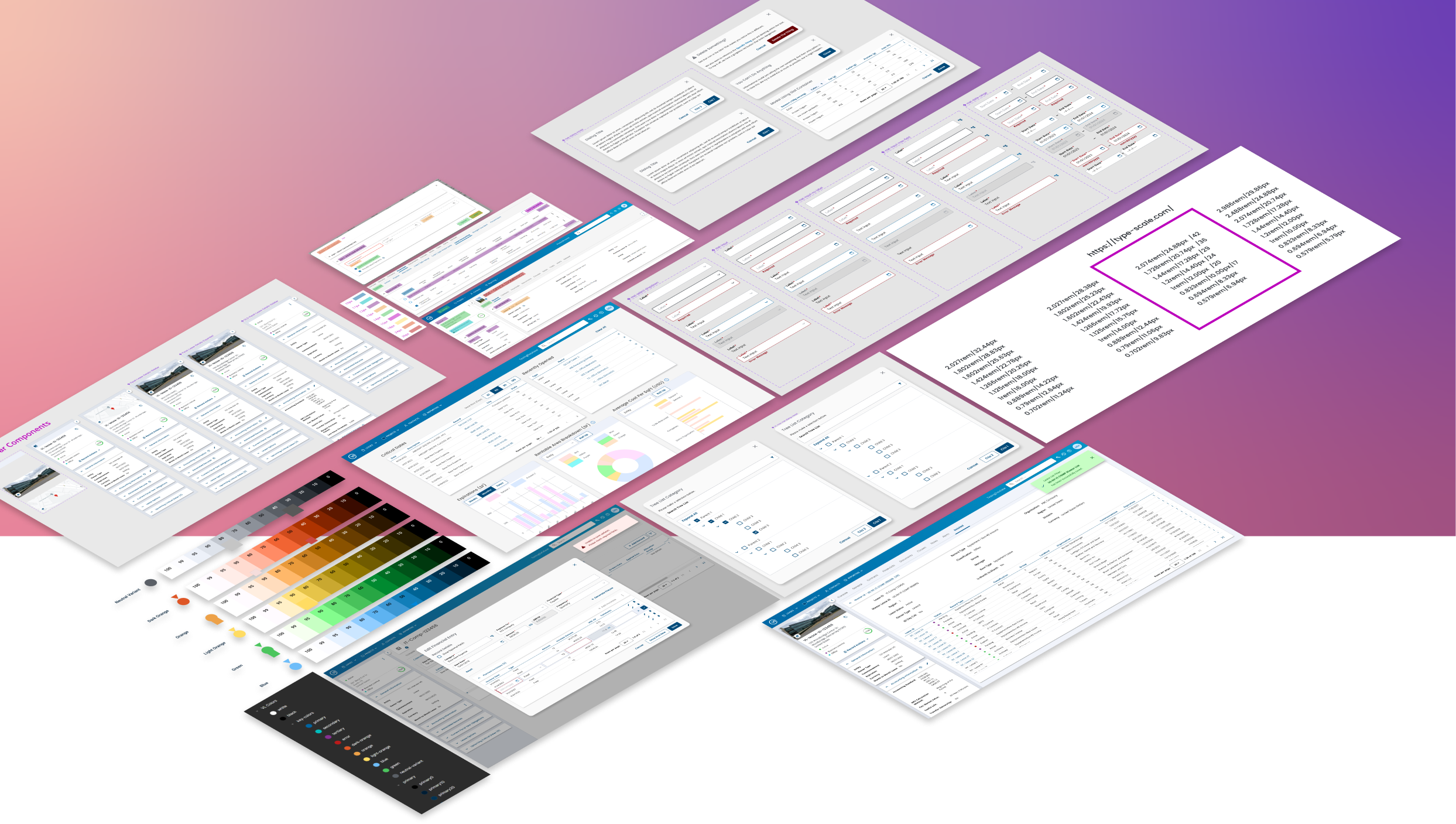
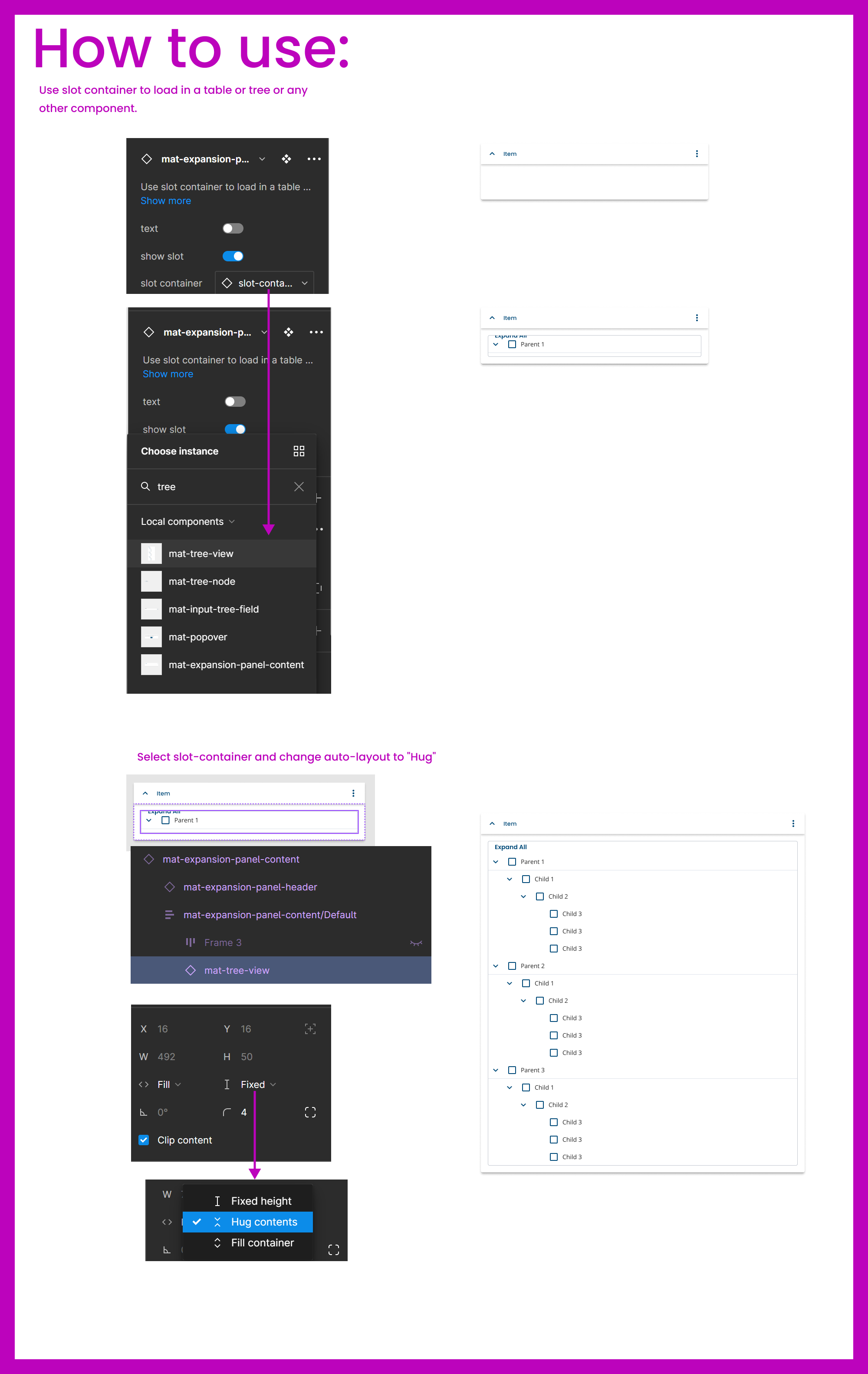
Component Refinement & Auto-Layout
Adjust Atomic Components to Fully Leverage Auto-Layout
Since development was using Angular and Material I wanted to start our UI library on the same path. I found an Angular-Material kit and pulled in our color and typography tokens. These tokens were inherited across the existing components.
We then went through each molecule and organism to make minor adjustments where necessary.
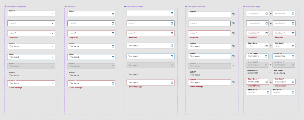
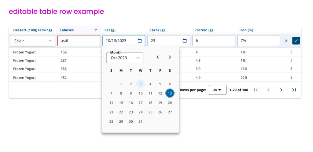
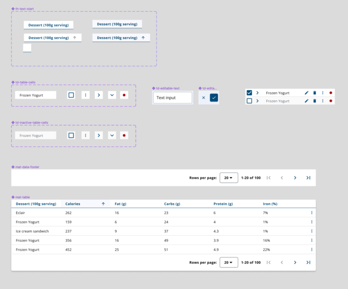
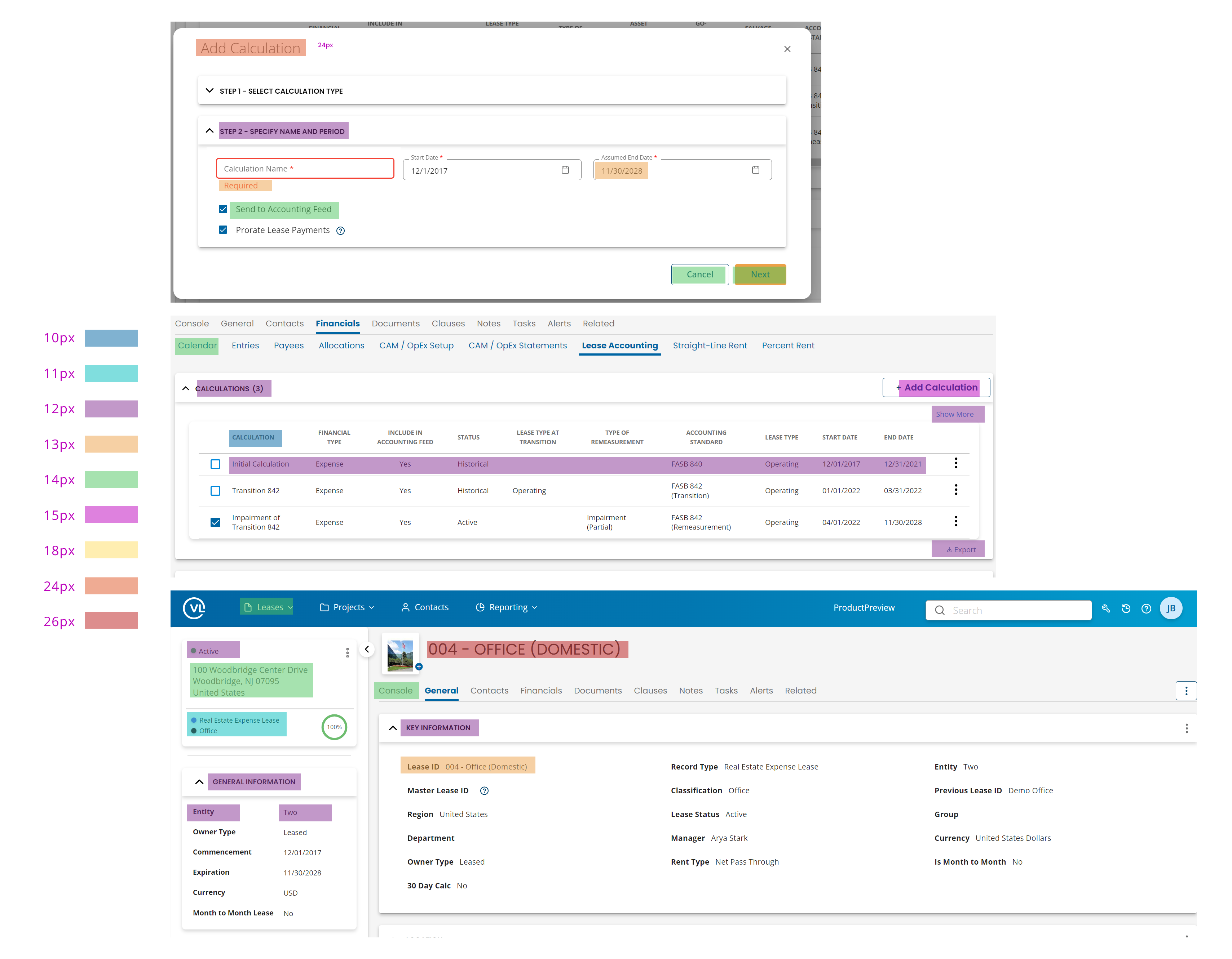
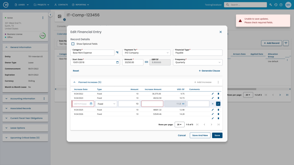
Build Out Common Components and Design Patterns
With the core UI components in place we were then able to build more complex custom components that would be leveraged in many page templates. We also ensured all atoms, molecules, and organisms fully leveraged auto-layout.
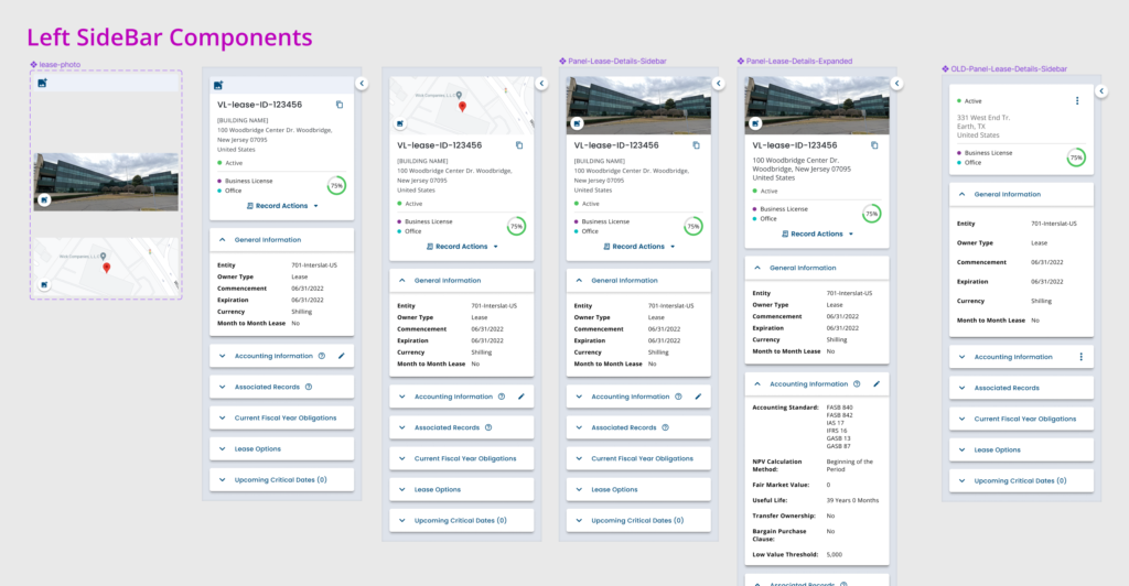

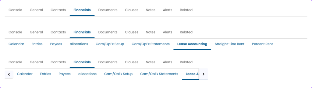
Design Patterns & Usage
As we started creating more advanced components we wanted to document how new designers in the future could understand how to use existing components. I created step-by-step guides for complex library components.
Outcomes

- Rebuilt entire UI library in less than 2 months
- Organized all design work so everyone could easily locate files
- Defined and established review processes within VL
- Reduced time for design mockups from 2 weeks down to 2 – 3 days
- Removed inconsistencies across designers
- Trained entire team to become proficient with auto-layout
- Reduced implementation issues when coding
- Designed out 6 month backlog for development
- Defined roadmap for updating the remaining code base to leverage tokens